The era of Big Data is well and truly upon us, but that data by itself serves little purpose (and provides even fewer benefits to your company). Putting data to good use is the purview of business intelligence. But, even well-researched and detailed business intelligence is not useful unless it is easy to share and understand. The insights that data analysts have carefully extracted from warehouses of data can be lost if the decision makers don’t understand what they’re seeing.
Though often overlooked, truly successful business intelligence relies on presentation and design to effectively and efficiently communicate results and meaning.
Visualization Lets You Spend Less Time Explaining
If a business intelligence report is a 20-page stack of sheets with an occasional pie-chart thrown in for flavor, the report itself will require explanation before decision-making can even begin.
Instead, a well-designed and insightful visualization can make the data instinctively understandable, allowing decision makers (and any other interested parties) to quickly consume the data, understand its implications and move forward with confidence.
Infographics, charts and proper data placement are all ways to help an audience see the bigger picture without having to slog through huge, dense chunks of text that slow down comprehension and run the risk of muddling the message.
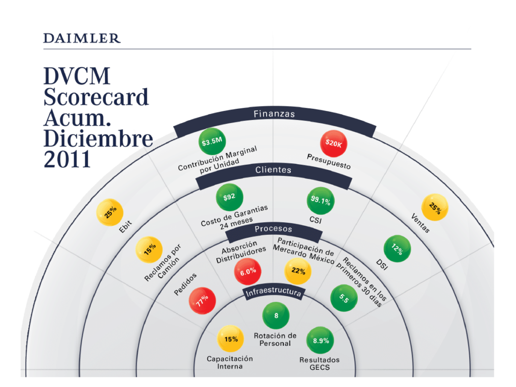
Take, for example, a visualization project created for Daimler Financial. Daimler wanted to produce a quarterly financial report that they could distribute – not only to upper management, but to their entire employee-base, including dockworkers. A traditional financial report would have made it difficult for most people to understand the state of the business, much less how they individually could impact it.
Instead, a visualization presentation was created that uniquely met both objectives, making the report easy to read and understand by all relevant parties.
Visualization Allows You to Look Beyond the Data
Much of a business’s success relies on external factors, but the internal factors should not be forgotten. Unlike traditional business intelligence reports, visualization allows data to be overlaid with macro and micro factors that make it easier to parse and understand. Examples include:
- Overlaying a company’s data with industry sales averages
- Seeing customer traffic over significant holidays or events
- Measuring the effectiveness of marketing campaigns against impactful weather events
- Tracking customer buying activities as they correspond to marketing campaign milestones
- Viewing customer satisfaction results as they relate to staffing changes
While that sort of data can be included in a traditional print report, an excellent visualization can make relationships more obvious. Those relationships can then help to explain and understand the root causes of success.
Don’t Just Bolt Visualization On At the End
It’s easy to think of visualization as ‘just a few pie charts in my report.’ Unfortunately, the effectiveness of that sort of visualization is usually limited to explaining or demonstrating only a small portion of what the entire business intelligence report is saying. To truly use visualization as a tool for successful business intelligence, the design needs to be thought about from the beginning, and the visualization should be the primary way a reader absorbs the data – not just an add-on to make a single element clearer.
Ultimately, the goal of business intelligence is to provide an audience with the insights they need to steer the business in the right direction. By taking a design-first view of a presentation, it is made easier for stakeholders to do their job.
If you’d like some help using visualization to explain the story behind your big data, contact us to see what the possibilities are.