Boost Labs is a
Product & AI
Implementation Partner.
We help businesses build AI-powered products and embed AI efficiently into how they already work.

We help businesses build AI-powered products and embed AI efficiently into how they already work.

Create new products and tools
Upgrade how your business operates
Make better decisions before investing
Turn your concept into a clear, actionable plan
before you commit a single line of code.


"This has been a massively beneficial partnership."
International Commercial Real Estate Company
"We came in with a vision and they helped us turn it into something real, and scalable."
International Cruise Line Company
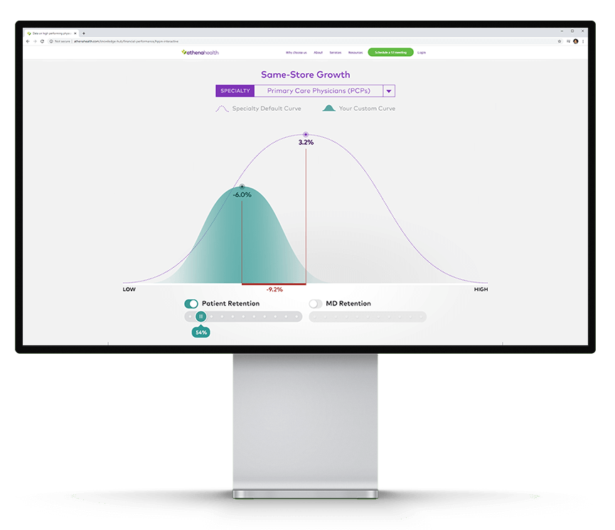
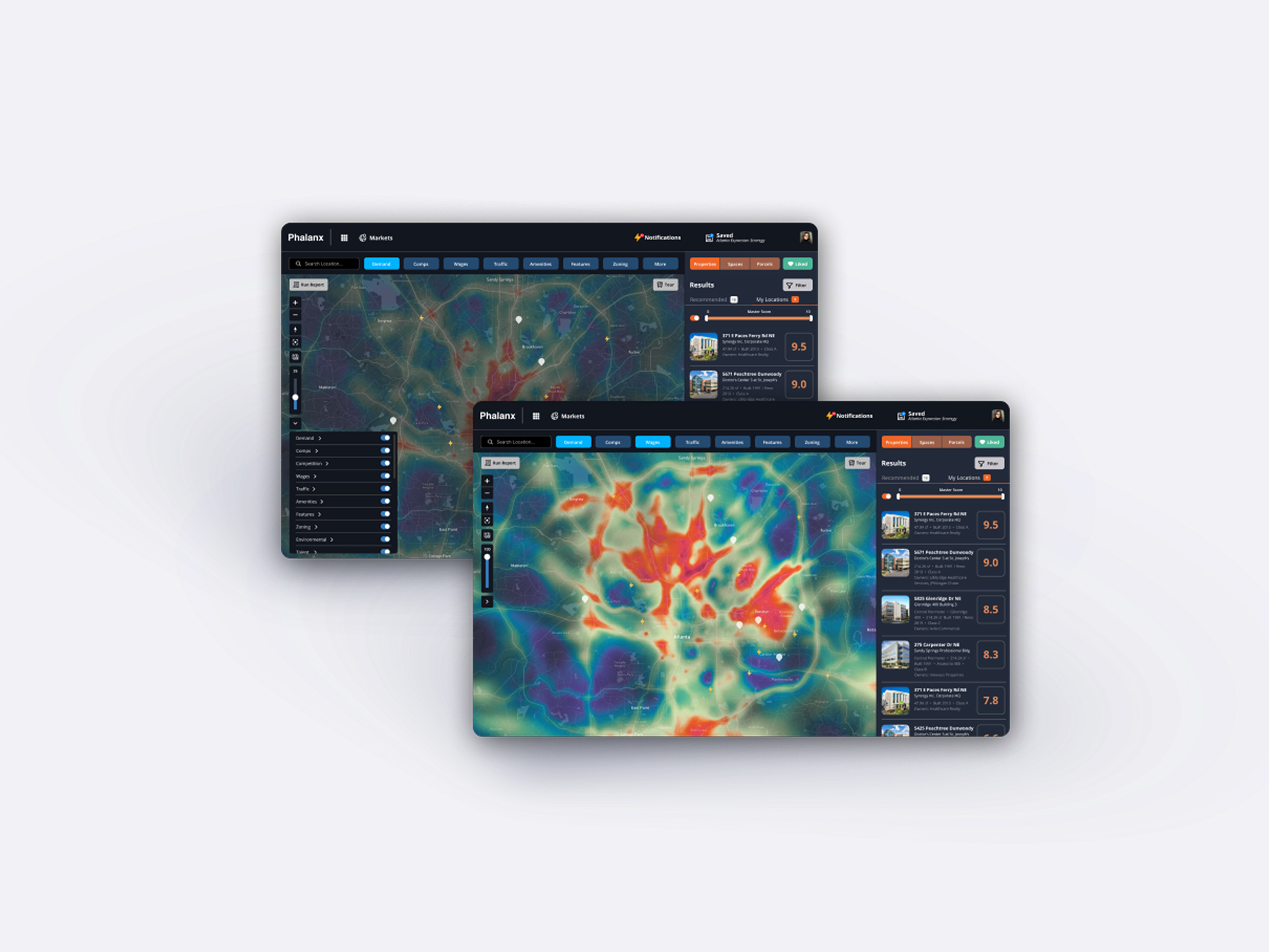
Helping businesses of all sizes create and scale digital products since 2009 — with a long track record in data visualization, data-driven products, and information design.
Trusted across industries


Whether you're ready to get started or just exploring what's possible, we're here to help you find the right path forward.
A focused, practical conversation.
No commitment required.