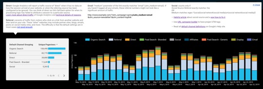
Google Data Studio is a free data visualization tool you can use online. You can build interactive dashboards and reports within your browser. Recently, we were tasked with creating a marketing dashboard for multiple sites AND create contextual info bubbles. Despite their complex and builds, dashboards don’t always have the context that your audience needs. But for any data insight to deliver value, your viewer needs to be able to understand the insights. Google Data Studios won’t label these things for you, but you can create custom tooltips.
Why is it important to have tooltips on a dashboard?
Imagine you’ve built a dashboard for management. Your manager looks at the dashboard but brings up a lot of questions because they can’t understand everything. Why can’t the manager read the data when it’s been visualized? Most (probably all) visualizations won’t be universally understood. Just because you do, doesn’t mean that anyone else without the same data knowledge will.
You can easily answer many questions by preemptively providing context:
- Where does the data come from?
- Is C included in the chart?
- Is that production data or test data?
- Do we filter out X and Y?
- Why don’t I see B?
- What does Z mean in this chart?
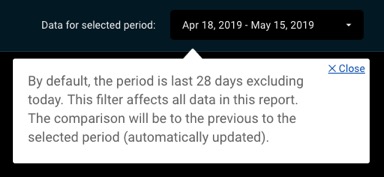
Even the default time range filter in Google Data Studio might be confusing for someone who isn’t familiar with the platform. It’s nice to have a tooltip that offers details:
Intro To Google Data Studio
When we first saw three dots menu next to our charts, we thought we had the ability to add annotations.
![]()
Instead, the button unfolds a menu of functions generated automatically by Google Data Studio. You can organize and download your data input, but there’s nowhere you can annotate the visualization.
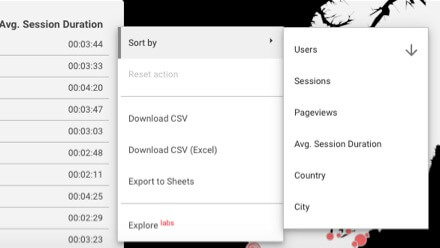 As of May 2019, Google Data Studio does not have an annotation feature. And so, we came up with a solution.
Making annotations
Adding annotations is easy to do.
To add tooltips, follow these steps:
1. Prepare a separate page for notes
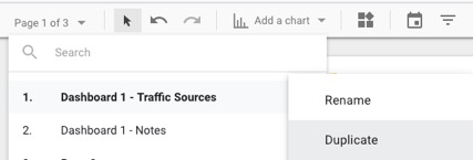
Create annotations on a separate page and link the pages to each other. Copy the current page and rename it:
2. Prepare Info button
Google Data Studio doesn’t have buttons, just text links. So place a text link to the text of your choice, such as “Info,” or use a Symbol like ℹ️.
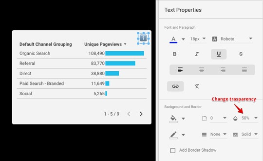 Want your Info button to be less visible? Just change the transparency of the text object. Or, to make your link, select text in the text object (CMD+A/Ctrl+A to select all text on hover) and paste the link to the Info page.
 Copy the link to the info page.
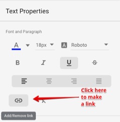 Once the text of the Info button is selected click, Add/Remove link button.
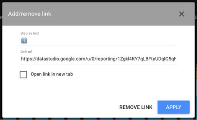 Paste the link to an Info page and remove the checkbox for “Open link in new tab”.
3. Place annotations one the notes page
When placing annotations, use as much space as you need.

4. Create a “close” tooltip button
To enable users’ ability to go back, use the text link “✕ Close” to direct users back to the dashboard page.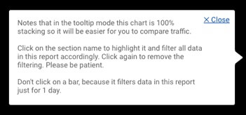 We suggest replacing the header on the notes pages. The header will indicate that the user is in Annotations enabled mode.
![]()
How can I make info-bubble pointers in Google Data Studio?
Tooltip pointers or arrows have to image properly when placed next to note background rectangles. You can draw your arrows or use ours, which we prepared for you.
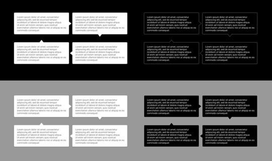 Tooltip pointers example https://datastudio.google.com/u/0/reporting/1Zgkl4KY7qLBFteUDqIO5qN6uZh6Nfbxo/page/2tGq
Here is the archive with the set of tooltip pointers: https://drive.google.com/file/d/1JPRN4IOoNqx31FwBD49cb_t7JbW_ofY_/view?usp=sharing
To use them paste an image object in Google Data Studio:

And upload the appropriate pointer in Image Properties section:
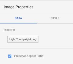 You may need to move the arrows precisely to avoid gaps between rectangles. To do that, select an arrow and move using Shift + Arrow keys.
Check it out!
If you want to see tooltips in action, check out some demos: here and here.
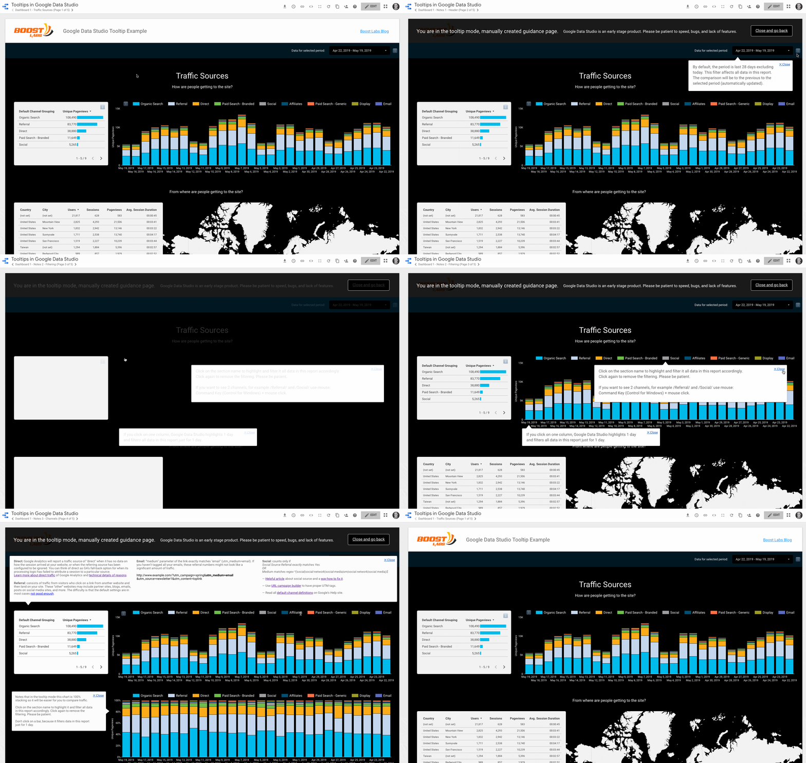
Not sure what to do next with Google Data Studio? Let us help! Contact us!
