Do spreadsheets make your head spin? Do volumes of documents make your eyes cross?
As a digitally connected society, we’re producing more data than ever before. While that’s welcome news for business owners who want to be in-the-know, it’s also incredibly overwhelming.
That’s where data visualization comes in.
While it sounds like a complex concept, it isn’t. This is simply the process of transforming intricate, lengthy data sets into colorful, meaningful charts and graphs that get the point across much quicker.
The best part? You don’t have to be a technical wizard to get the hang of it. In fact, you don’t even have to work in a technical industry.
Today, we’re sharing nine data visualization examples from companies who have used the approach to express difficult concepts in a visually stunning way. Ready to be inspired? Let’s get started!
What Sets a Great Data Visualization Apart?
Yes, a good data visualization is one that appropriately translates sophisticated and hard-to-understand insights into simplified illustrations, making them more accessible and easier to analyze.
However, that definition only roughly describes what a data visualization should entail.
A great data visualization not only does its job of simplification. It’s also compelling and visually stunning enough to stick in the mind of its viewers while still being appropriate to the data it represents.
That said, let’s take a look at nine examples of data visualization done right.
1. Selfiecity
According to Google statistics, Android users alone send more than 93 million selfies every day. Taking advantage of that massive data set, the brains behind Selfiecity decided to explore the demographics of people who take selfies.
How do they normally pose? What are their most common expressions? Does geographical location or gender make a difference in what people do in front of the camera?
These are just a few of the questions that the Selfiecity project seeks to answer. To date, researchers have analyzed more than 120,000 selfies from different cities around the world, including:
- Berlin
- Bangkok
- New York
- Sao Paolo
- Moscow
As they report and update their findings, they’re organizing them into interactive data visualization tools that users can access explore here. Imageplots serve as rich media visualizations, revealing thousands of photos side-by-side, organized by head tilt direction. Taking it a step further, they even allow web visitors to explore the entire data set of 3,200 photos via the SelfieExploratory.
Though this data was complex and multi-faceted, this team found a way to make it both interesting and useful, encouraging hands-on investigations!
2. The New Yorker: Citi Bike Availability
In 2013, New York City initiated its first bike-sharing program, called Citi Bike. Soon, everyone from late-to-work commuters to celebrities were seen cruising around town on one.
Sensing a movement, the New Yorker newspaper decided to use live data from bike rides all across the city, tracking the number of people who used a Citi Bike in one month.
To gauge the popularity and success of the bike-sharing program, the publication released the findings of its month-long study in the form of a visual map. Using a red dot on the timeline slider to move through days and weeks, users can see how many bikes were available at any given time during the research period. In addition, for each day, they can see:
- The number of trips taken that day
- The weather conditions
- High and low temperatures
- Precipitation amount
This was a creative and innovative way to discuss the Citi Bike program, identify patterns and trends, highlight pain points and pave the way forward.
3. The Atlantic: Population Healthier
American magazine The Atlantic, in tandem with AthenaHealth, decided to tackle a much-discussed topic in the healthcare industry; Can community health be a viable alternative to traditional medicine and healthcare practices?
The project, dubbed Population Healthier, took an in-depth look at Lowell, MA and its Circle Health Alliance. The latter is the term used to describe every form of healthcare in the city, from major hospitals to intricate networks of physicians.
Why is this location important?
The city has managed to lower its overall cost of care while improving the health and well being of its citizens. If the Circle Health Alliance is this effective, it could lay the groundwork for similar systems around the country. The online data visualization features the text of the case study on the left side of the screen. As viewers scroll down, the screen changes.
From an interactive 3D rendering of the Lowell Community Health Center to a chart illustrating the city’s non-white race distribution, the data is informative and relevant, revealing just what makes Lowell such an interesting case study. In addition, it’s also sleek and well-designed, making it that much more accessible.
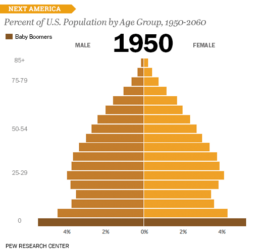
4. Pew Research: U.S. Population by Age Group
Understanding the current demographic trends is one thing. Comparing this data set to historical trends is another. That’s exactly what the folks at renowned Pew Research decided to do.
This sparked a data visualization project that turned a bar chart into an animated GIF, revealing the shape that the U.S. Age Pyramid takes over time. The result? Researchers found that it will create a rectangle by 2060! By then, there will be as many people over the age of 85 as those under the age of five.
The team explained that while line charts are usually ideal for showing change over time, this data included too many variables. This would have meant a messy line graph with a complicated line structure that would have been difficult to follow. Instead, researchers turned to a bar chart.
This way, they could capture multiple age ranges all at once, with the animation revealing how changes to the bars’ length affects the overall shape of the population. The researchers also made smart use of color, assigning different shade to distinguish between male and female populations, as well as to identify the Baby Boomer generation as it rose among the timeline.
5. The Washington Post: The Depth of the Problem
Data visualizations aren’t just suitable for capturing and simplifying large sets of data. They’re also a great way to show scale in an interesting and relevant way.
Take the project titled “The Depth of the Problem“, created by the Washington Post.
Catalyzed by the missing Malaysia Airlines Flight 370, the project reveals how far an airplane’s deep-sea signal, emitted from its onboard black box, can be detected. The visualization is incredibly long, and that’s the point.
By the end of it, viewers understand that the signals are detectable at a depth that exceeds the length of an inverted Burj Khalifa, the world’s tallest building. At 2,717 feet, that height is minimal compared to 4,600 feet. That’s the depth to which the pinger locator was lowered when the crew detected a deep-sea signal from the missing airline for more than two hours. Still, to hear the beacon on the bottom of the ocean, the locator would have had to travel to a staggering 6,000 feet deep.
Ultimately, the signal was detected 15,000 feet below sea level, or around three miles down. That’s deeper than the wreckage of the Titanic, which took 73 years to locate.
These are key facts that can be difficult to explain in text, but the Post’s powerful vertical visualization makes a striking impact. The varying tones of blue, which grow darker as the user scrolls lower, speak to the incredible depths without saying one word.
6. The U.S. Government: Interactive Government Budget
Let’s face it. Budgets aren’t riveting. They can be obscure, full of jargon and difficult to understand.
However, the Obama Administration sought to make it as simplified and transparent as possible. This interactive government budget, created and shared by the White House, breaks the spending down into manageable categories.
Although the design is a basic treemap, it remains one of the most significant examples of data visualization in recent history, archived and still available online. In it, the administration explains where taxpayer dollars would go, and which programs would receive which amount from the Federal budget if the proposed plan passed approval.
The categories included on the map were:
- Healthcare
- National defense
- Income security
- Social security
- Net interest
- Veteran benefits
- Transportation
In addition, there were sub-categories listed under each main header. For instance, healthcare included Medicare, Medicaid and children’s health insurance, health research and food safety, and other forms of healthcare. By hovering over each category, users can see the exact dollar amount proposed toward it.
Though it isn’t the most sophisticated example on this list, it’s one of the most prolific, marking one of the first times that a major world power understood and utilized the power of data visualization.
7. Concert Hotels: 100 Years of Rock
Who said data visualization had to be boring?
Concert Hotels, the organization that connects concertgoers with nearby accommodations, put together a dazzling, interactive history of the history of rock n’ roll. The line chart travels from the pre-1900s to 2000, covering every genre of rock imaginable, from folk to post-punk.
Users can click on any of the genres to hear a sample of the music that defines it. The visualization makes excellent use of color by assigning each genre its own hue, helping to keep the many lines distinct from one another.
Clicking on the animation link at the top instigates an automatic scroll-through of the entire timeline, taking you from early jazz to modern neofolk in under one minute. This is one example of how data visualizations can merge different forms of media to create an immersive user experience.
8. BBC: Are We Alone?
How many alien civilizations are out there? This is a question that has haunted researchers for centuries, and there’s still no concrete answer.
The tomes of research on the subject could be compiled in a lengthy document but this data visualization from BBC makes it accessible to everyone outside of the science field, too.
A veritable Choose Your Own Adventure-type graphic, this project invites viewers to apply American astronomer Frank Drake’s calculation to estimate how many extraterrestrial civilizations could exist in the universe. Then, it takes them through different hypothetical scenarios to stretch their imaginations even further.
In this way, the project blends storytelling, data visualization, and gamification, engaging the viewer from the onset and encouraging participation through the end.
9. Nikon: The Universcale
Nikon is proud of its optoelectronics technologies that empower users to see elements and dimensions beyond what the normal eye can perceive.
To illustrate these capabilities, the company created a data visualization known as the Universcale.
This presentation shows the relative size of all known objects in the universe, all arranged on a single scale. This way, viewers can grasp the true size of objects, including those that will not ever be comparable on a side-by-side basis in real life.
By clicking on any object, viewers can learn its average size, along with an object that it’s smaller than and bigger than, for comparison. This impressive undertaking serves to illustrate that Nikon’s electron microscopes and astronomical telescopes alike are powerful enough to capture both the smallest and largest objects on Earth, even those that were invisible until now.

Let These Data Visualization Examples Inspire You
These data visualization examples prove that you don’t have to have a master’s degree in software development to create a stunning, informative and groundbreaking project.
Armed with your datasets, all you need is an expert team capable of transforming those insights into powerful tools like those described above.
That’s where we come in.
We’re a team of data visualization professionals dedicated to helping our clients turn their heaps of unstructured data into reports, presentations, and products that fuel mission-critical activities and important decision-making.
Contact us today to tell us about your project and learn more about what we do.