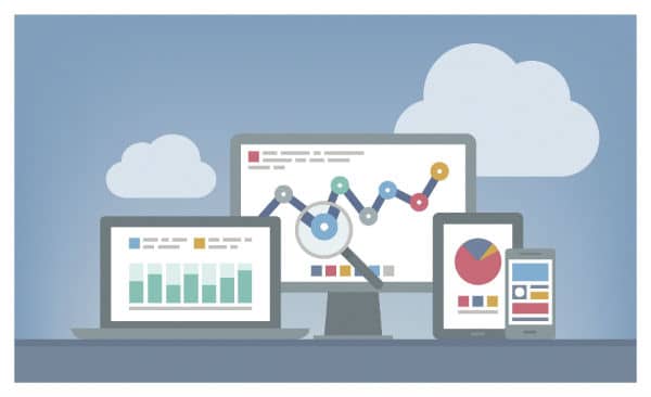
Using big data effectively, at its heart, is just another form of storytelling. Like a story, big data isn’t effective unless the audience comes away from the experience changed. Of course, also like telling a story, creating that sort of impact isn’t easy. We talk a lot about “telling stories with data”when creating data visualizations, but what does that actually mean?
Why Call it a Data Story?
A story is a complete method of transferring information. It starts by setting the context or setting, adds layers of information and change, and finally reaches a conclusion. This package gives the audience everything they need to understand why they are hearing the information, what that information means to them, and how they should use the information going forward.
A well-executed data visualization does the same thing. In a single package, the visualization explains the context, provides the information, and gives a conclusion. In order to make that happen, you need to think about your data as a story.
What Exactly is a Data Story?
A data story isn’t much different from any other story – there’s a point you want to make and you need to lead your audience on a path from ignorance to awareness. The biggest difference with a data story, however, is that they’re usually inspired in one of two ways:
-
-
You have a collection of data you’d like to put to use – the ending isn’t well-defined, but you have all the elements necessary to get there.
-
-
You know the point you’d like to make and want to use data to back it up – you know the ending you’d like, but may be unsure of how to use your data to get there. You know what you’d like to show, but have to interpret existing data to see if it works, or compile new data to make your point.
Whether you’re starting at the end and working backwards, or starting at the beginning and discovering where your data leads, you motivation is to inform, educate and maybe even entertain to your audience.
How do you Tell a Data Story?
Like any good presentation, telling your data story starts by knowing your audience. Unlike a more traditional story, however, your data story requires a more in-depth understanding of your audience to be truly effective. Ideally, you can define your audience by answering these questions:
-
-
Who is your target reader/viewer? (What role do they play, title do they have, etc…)
-
-
-
What do they want to know? (What information is important to them.)
-
-
-
How do they like to see data presented? (Are they likely to prefer an in-depth data table, or will charts and graphs be sufficient? )
-
-
Where will they find your data story? (How it’s best distributed will help you understand the medium you can work with)
The format you choose for your data story will rely heavily on your target audience, but there are several options to choose from:
-
-
Text
-
-
-
Infographic
-
-
-
Interactive Data Visualization
-
-
-
Motion Graphic
-
-
-
Video
-
-
Interpretive Baboon Symphony
There’s still plenty of work to do from this point. understanding what kind of story you want to tell, who you want to tell it to and how you’ll be telling it are the most critical decisions for creating an effective data story. Big data is, as its name suggests, imposing – but the most important element is the story it tells. Finding those stories and telling them is how you can make big data work for your marketing goals.