What is Data Visualization? The term Data Visualization is used often and most oftentimes techies like us will usually provide an overly complicated answer. The real basic meaning is the ability to graphically represent data. A better way of describing it is to visualize what we mean:
Raw Data
The biggest challenge for our clients is the ability to communicate this information into an understandable format for an audience outside or inside the organization. Add multiple data layers and data mashups, the explanation grows longer and more complicated ultimately loosing the attention of the intended audience.
How Data Visualization Can Help
Our typical engagement with a client starts with a basic infographic or visualization of a data set. What we have found is the initial visualization/information graphic helps our clients view their data from a different point of view. Check out more about our infographic & data visualization services here. The Data Story becomes a real object to view and play with. The power of a basic infographic can open the doors to more possibilities, questions, ideas, etc.
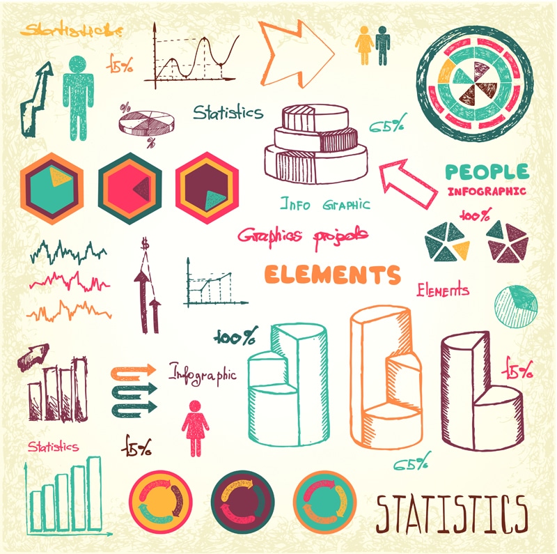
Sketch:
It all starts with a sketch. Seeing how the data comes alive through a sketch, provides the opportunity to fully understand the value of the data set. With constant interaction with the client, what once was a sketch is now a infographic
Infographic:
Examples of interactive visualizations:
- Dashboards
- Interactive reports
- Interactive presentations
- Custom web interface
- Custom mobile interface
Need More Info on Data Visualization – Call Us (301) 560-7901