If you are non-profit, you are probably aware of Charity Watch, an organization that exposes non-profit abuse and advocates for donors. Charity Watch “dives deep” into nonprofits and grades them based on transparency. Non-profits that have a bad grade or low score usually have one thing in common…lack of financial transparency or questionable allocation of funds.
According to National Center for Charitable Statistics, there are over 1.5 million tax-exempt organizations that include almost 1.1 million public charities. In 2013, 21% of revenue came from contributions, gifts and government grants. 21% doesn’t seem to be that much, but every non-profit knows that it is critical for growth. Non-profits know people want to give to causes to make the world a better place, but they also know the number one concern is how their money is used. Is their contribution going to salaries, expenses or to specific humanitarian needs? People want to see a breakdown. They want to know if they can trust you. This is one of the reasons people look to organizations like Charity Watch.
At the same time, people love good stories. This is why Habitat for Humanity has a story page on their website. They love to enter in and become a part of a story with a cause for the greater good. Real life stories are great, but non-profits still need to show the numbers and build trust before people enter in the story. The problem: the numbers (i.e. data analytics and financial reports) are not completely understandable by everyone. If the report is too complicated, the audience will be less likely to understand the real picture. This, however, doesn’t need to be the case.
What if you could simplify the complexity by using visual storytelling?
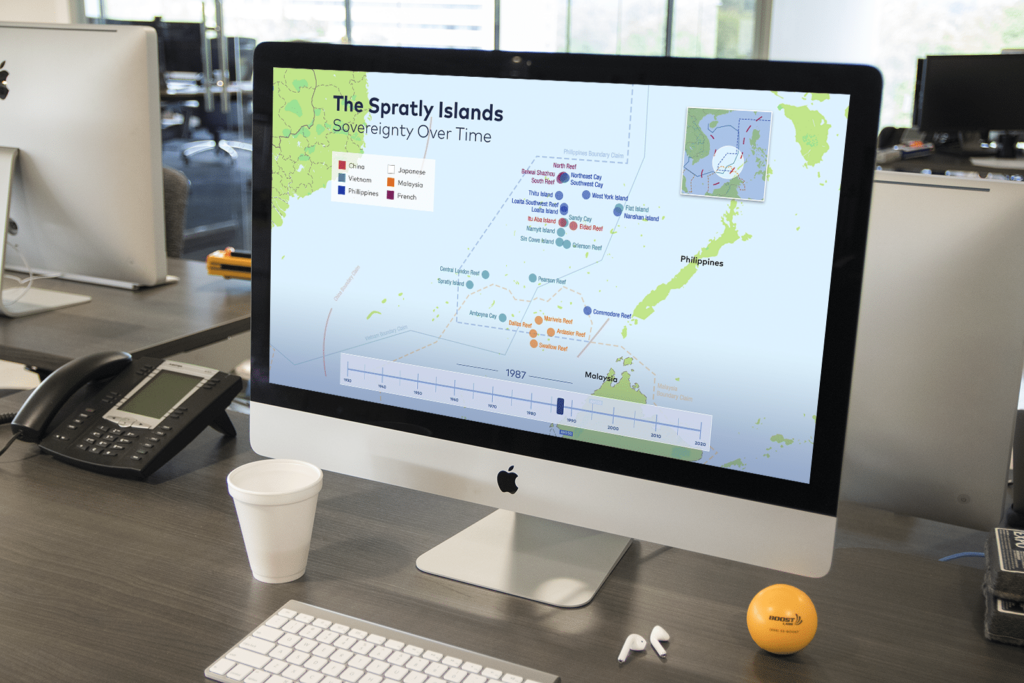
This can be done through data visualization which is an effective way to share impactful stories using qualitative and quantitative data. When people see the story through the data visually, it builds trust and influences them to join the story as a contributor. We’ll give you an example. Recently, we created a data visualization report for World Justice Project. We took the raw data to craft a story behind the Rule of Law in Afghanistan. What could have been boring charts and statistics became an engaging and educational story that influenced action.
How can data visualization help you create a story that influences action and builds trust? We have some ideas:
- Create a visual timeline to show the impact of contributions and grants and how they were used. Build the trust.
- Integrate success stories and testimonials with your data to show missional impact through the combination of giving and volunteering
- People love to join a cause that builds positive community. Use data visualization to predictively show the long-term effects of community-building.
- Illustrate how a cause or disaster relief would be affected if the nonprofit was not there making a difference.
Because every non-profit has a different story, the ideas are endless with data visualization. Using data, it could be an infographic to illustrate the difference the nonprofit is making, a real-time data dashboard to show the urgency of giving to a specific cause like hurricane relief, or an interactive report to build trust with contributors. All ideas have a common factor, that is using data in the form of a story to influence action and build trust. When people see the story through your data, they are ready to enter in the story and contribute.
So, the question you need to ask yourself. Is my data telling an impactful story? Am I using my data as an asset to influence action or am I using it for internal eyes only? Contact us to learn how data visualization can help you make a difference in your missional impact.
