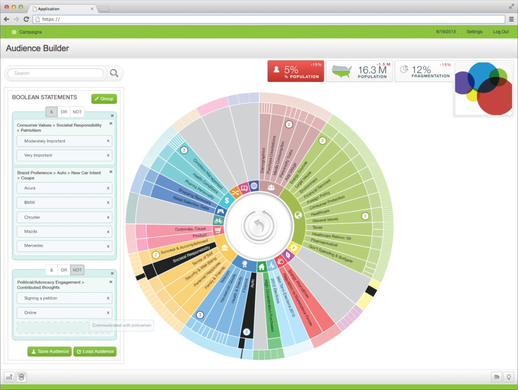
Any business or organization that has gone through data product development (dashboard, app, software, etc) knows effective design requires just as much attention as data. UI (or user interface) design is the very first thing your audience sees and collects new data, so it needs a smart approach to have the best possible performance.
Why is it so important? How do I make it better?
UI design for a data product is more than just a pleasurable view, it’s the very first contact your audience has with the product and the final stage of production to bring value to your data. If a customer or client doesn’t like or has difficulty with the interface, they won’t enjoy the interaction. This can lead to fewer engagements, bad branding, and ultimately having a product deemed as not as successful. Why build a data product that won’t connect your audience to the data and doesn’t build ROI? The user experience is imperative to product success and is a catalyst for important decisions internally.
Any front-facing visualization, whether it’s a dashboard or an application, needs an engaging interface. Even if you’re not building a brand new application, try updating your current interface and see better results.
So how do you start?
Begin with the data…
When it comes to designing the user interface, you can’t leave out data. Product development should have already undergone heavy data analysis that ties in with the final design. Because the design depends on the data story, you need to make sure the insights are inline with the priority use cases.
Research the best fit for the best possible solutions and results (not to mention your investment).
- What do you want your audience to take away from the experience? What insights or impressions should be obvious?
- How are you presenting the brand, the data, and the product?
- What purpose does the design serve? How does the design affect the user experience?
- Which design has better navigation? Better mobility? Better readability?
These are a few of the many questions that come up during our Discover Workshop.
Who is the user?
Starting any UI design starts with identifying user personas. Depending on your business needs, you’ll be targeting specific demographics as an audience. Is it the general public? Specific industry or job field? Once your audience is identified, you have to scrutinize the true user need. Don’t rely solely on internal logic because you’ll overlook real end-user needs and end up with an ineffective product.
The customer must be able to intuitively find value in the product via a well-designed interface.
User personas identify the true user to determine the necessary elements and help guide user flow design.
- If the ideal user is a shopper, what are they looking for? How much are they looking to spend? What do they want?
- In a specified industry, specific roles need specific data. What information do they already know?
Mapping pathways, workflows, and journeys help produce the final design.
- Where should X be placed? Is high visibility imperative to performance?
- Is Y easy to find? Is this information readily available or is it too difficult to understand?
With a better understanding of the end user, you’ll be able to balance both the aesthetic branding and effective UI. This is when design really comes into play because the right resources will be able to envision a final solution.
If you have any questions about this topic, please feel free to reach out to us for more information by filling out the form below.
Contact us today and see how we can help you with analytics and data visualization.