You’ve got data… a lot of data. Ignore for a moment what the data represents and ask yourself: how do you know if the data is valid? How do you know if the data set is large enough, or the right kind of data? How do you even know if it’s being collected properly?
If you said hours and hours of data analysis, you’re absolutely right. However, analysis alone may not provide reliable insight into how well your data has been collected, categorized and presented.
A visualization tool can provide these insights in a clear and concise way. Using visualizations tailored to fit your needs as tools for data management will not only assist and streamline your analysis process, but will also present your results in a format easily consumed and used by individuals lacking data analysis expertise.
Data Visualization Shows Where Your Data is Lacking
Often, visualization is thought of as a way to view results. While that is true, it ignores the fact that a good visualization can actually make the project run better from the beginning.
The process of creating a visualization prompts you to think about how your data will be categorized and the story it will tell. It’s during the design phase of a data visualization project that potential issues or areas of opportunity become clear. If you wait until all of the data is already collected, you may miss your chance to invest in another round of data collection in order to get your best results.
Visualize This – A Data Management Case Study
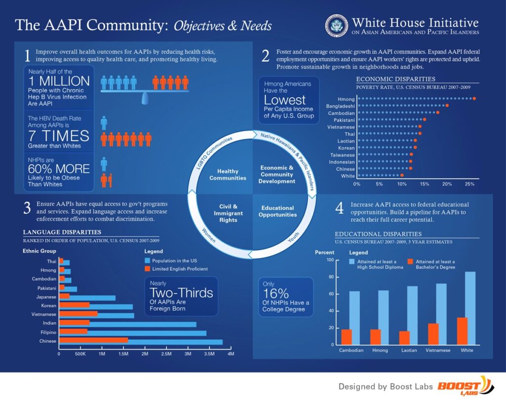
Boost Labs partnered with the U.S. Government to create a data visualization on Asian Americans and Pacific Islanders for a White House Initiative. When the project began, the data had already been collected and the task was simply to design a visualization that would illustrate the results.
Early on in the project, though, the visualization showed that the White House Initiative could collect some additional data that would bring the results into better focus. A second round of data collection allowed them to collect that extra information and the final results were more successful. If a visualization tool had been used to manage their data from the onset of the project, they could have seen these areas for opportunity early on and collected the necessary data sooner.
Use Your Analysts More Effectively
Traditionally, companies employ an army of researchers and analysts to make sense of all their data and be sure it is applied correctly. There’s nothing wrong with that method, but imagine being able to employ those resources on other tasks and projects.
Visualizations simplify large quantities of data into easily understood graphics, charts and reports. These results can then be interpreted by someone other than analysts. By packaging data in a way that makes sense to management and other employees, decisions can be made quicker and with fewer resources.
Visualize This – Another Data Management Case Study
Another client had a large collection of audience profile and activity information. Boost Labs was recruited to help in understanding what this data was saying. The client was initially confident that the data was collected, processed, and categorized just as it should be – after all, a team of analysts was managing the data.
After creating graphical representations of the data, concerns appeared. The researchers began to see that the data didn’t tell the story they thought it would, and that it could be structured differently and more effectively. That’s not because the analysts were doing anything wrong, but because without effective visualization, the relationships between the data points were not clear. If the client had a visualization tool from the onset of the project, they would have been able to use their analysts for other business objectives and structure the data the way they wanted it, right from the start.
Having a visualization tool designed and integrated from the outset of your project provides a window into your data. It adds yet another perspective from which to analyze findings, and affords an organization the opportunity to tweak collection and organization parameters along the way.
Gathering accurate and organized data, clearly understanding the facts and figures, and ensuring that actionable information is extracted from the material– that’s what data management is all about. Making it easier, more efficient and more effective is what visualization is all about.
Boost Labs can provide a window into your data management to ensure your projects and/or businesses are successful. Contact us to get started.