Now that nearly 60% of businesses are using infographics, data visualization has taken over the internet. While some of these graphics are simple and informative statements, some of them take into account all kinds of complex information. Through online data visualization tools, more companies than ever can show their teams how they’re doing in a simple image.
Here is everything about data visualization, how it works, and how to use it.

Understanding Data Visualization
The types of techniques that are used to communicate information allow people to understand complex concepts more easily. Data visualization is a method for taking complicated datasets and turning them into images. Rather than trying to get everyone to understand complicated data, a striking graphic makes things clear.
Data visualization is now a big part of data science. Because data sets can be so large, so complex, and dependent on so many factors, we need the visuals to drive a conclusion home. With the number of technologies now available for modeling data, there’s never been an easier time to visualize information.
With 2.5 quintillion bytes of data being created daily, making sense of most of it seems like a gargantuan task. We have barely figured out how to store it all. Going through any major dataset line by line is too much for any one person. Data visualization is now part of the collection process.
Traditional descriptions of data can fall short. With the help of visualization, the correlation between the two concepts is much easier. Patterns on a graph can be far easier to understand than information laid out in a narrative.

How We Think Matters
Understanding how we gather and process information is both an evolutionary and cultural development. How each person forms thoughts, how we remember things, and what we take away depends on how we’ve been taught.
Unconsciously and automatically, most people read text and process information on a sign. We can also figure out where a sound is coming from and the difference between colors without thinking of it much. If we’ve been taught to ride a bike, that information is kept for automatic recall.
It takes more time to find the difference between multiple pieces of information, like multiple signs or two similar images. While we might respond to certain social cues, explaining and understanding them might take a more considerable effort. Even telling someone your phone number requires a type of thought we don’t often engage in.
The information that’s expressed during these processes takes more time to learn than some other types. That’s usually the level of information that comes from a study or dataset. Data visualizations give us the chance to take in information that we otherwise might not get.
Types of Data Visualization
The way that information is formulated via an image depends on the data and the aim. If two things are being compared, one time, a simple pie chart or bar graph could work. However, when they’re changing over time, you could see a line graph showing trends or another type of visual altogether.
Regardless of the subject matter, the way that you visualize it can make all the difference. Here are some common types of visualization to consider.
1. Time Series Charts
Line charts are one of the most common types of data visualizations. You get to see the change in numerous variables over time and track trends as they increase or decrease. You can place a nearly infinite number of pieces of data on one of these, comparing all kinds of similar or related trends.
When time is one of the most important factors to consider related to a trend, this is the type to use.
Area charts are a similar type of chart. They show multiple values over a period of time. When cumulative changes in multiple variables tend to add up or decrease over time, this is a great choice.
2. Ranking Charts
Ranking items is a common way to draw simple comparisons. When you need to communicate important changes that compare to one another squarely, ranking is the way to go.
Population pyramids are good for when you’re talking about larger social trends. Complex social narratives are hard to describe. Using a population pyramid, you can show the distribution of a population and its relationship to time or compared to one another.
Bar charts are similar to line charts but use bars at each data point. This is a smart solution when multiple variables are at play. If every one of these elements is measured over a similar timeframe, bar charts show how trends that are related change over the same periods.
When you need to show deviation, you use a bar chart with “actual” versus “expected” results. These allow for viewers to watch the figures compared so they can plan for the future.
These can usually only cover a single variable and are often good for economic or sales figures. When a company expects to use, buy, or sell a certain number of units, these bar charts can help C-level executives understand performance.
Knowing how you met expectations can inform stakeholders of where things are versus where they want them to be.
3. Comparing a Part to a Whole (Pie Charts)
When you think about comparing a part to a whole, one of the first types of charts that comes up is a pie chart. That’s just one of a number of ways that you can compare a part to a whole.
In a pie chart, you get to see parts versus a whole on a percentage basis. This is hard for most people to see unless you’re just comparing two or three things. You find them the most often when you’re looking at budgets and spending.
Pie charts need to have both percentages and real figures to accompany them. They can be confusing to look at for more than a short period of time though because there’s often so much more information underneath.
Treemaps allow you to show hierarchical information in a format that’s simple and nested. With rectangles that are proportional to each category, you get to see the percentage of a whole. When there are many categories, this can be valuable.
It’s another proportional type of data visualization that also requires a little bit of turning your head around.
4. Correlation and Frequency Distribution Charts (Scatter Plots)
Showing how points relate to one another is a very important element in data visualization. While each element might not be important, seeing trends is important.
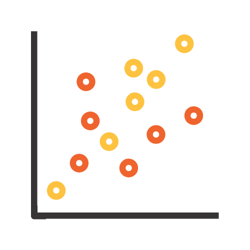
Showing how two variables correlate is best seen through a scatter plot. Scatter plots show the correlation of two variables via an X and a Y-axis. Dots that represent each piece of data can lay out where instances occurred or where things appear on a spectrum.
Frequency distribution is often shown through histograms, plotting the number of times events occur within the data. These are shown through bar graphs that show an occurrence usually over time. When you want to know the likelihood of an extreme event, you can look at how thing have gone historically.
Box plots are a visualization that shows a measurement of dispersion. Boxes represent data points and the lines within boxes show a median. Two lines come out from the box as “whiskers” showing the two extreme quartiles at the maximum and minimum values.
Showing the distribution of one or more datasets is easier than using a histogram with the help of box plots. If space is an issue, then box plots are the way to go.

5. Nominal Comparison Charts
When you’re looking to show simple comparisons, this is the best way to go.
Bubble charts are similar to scatter plots but the size and color of the bubble can also show additional data. When you’re comparing three or more variables, you can use a bubble chart to show the complex relationships between them.
Heat maps allow for a graphical representation of data. When each individual value is part of a larger matrix, look at the shades for more information. These shades can show a quantity based on what the legend says.
These are useful for people who need to analyze a variable over a large matrix of data. If timeframes like days or hours are part of the information set, then it’s easy to show with a heat map. The shades also let people see extremes quickly and easily, making conversations about them much easier.

6. Relationship Charts
Data visualization for relationships isn’t as complicated as it might seem. Most of the above examples can be used to describe the most common types of relationships. Complex relationships between entities are hard to show under most circumstances, however.
Using a network diagram is a good way to show these relationships. Showing each entity as connected to the others and forming a network is easier to do with one of these types of diagrams.
Comparing how things work inside of a larger network is usually how you might show something like flight paths. Tracking how they work together and complement one another is best suited for a network diagram.
How to Use Various Charts & Graphs
Knowing which type of data visualization tool to use and when is a challenge when you’re thinking from the side of the data. However, when you choose the right type of tool, you’re able to really strike the heart of the subject you’re tackling.
There are disciplines across the globe reliant on this data. Businesses, public services, and academia all rely on data visualization to communicate. Here are some common examples.
Usage in Sales
Sales and marketing rely more and more on digital data as times goes on. Keeping track of traffic online has never been easier thanks to data visualization.
Relationships between a marketing sprint and engagement can be hard to show. There are so many factors involved. However, with the right visualization tool, marketers can show executives the power of each individual concept and the cumulative aspect of them together.
You can track traffic and how it relates to each decision that your company has made over time.

Finance Loves Visualization
Walk into any Wall Street office meeting and you’ll find data visualizations everywhere. Finance professionals rely on them for tracking performances. They often have to look at overall trends and visualizations help a tone.
Charts show how a price has changed over time and using those charts, an argument can be made to supervisors to follow trends. It allows brokers to make successful decisions that help out their clients.
Candlestick charts can show the edges of a trend, where things went down, and where they went up. These visualizations show changes in price better than a grid of data points.

They’re Huge in Politics
From Five Thirty Eight to your favorite TV political shows, you’ll find data visualizations coming at you at every commercial break. From heat maps to comparative charts, looking at how people vote and what people are concerned about is important.
It not only shows pundits what’s happening in the world but it also shows us how we’ve grown as a country over time. No matter how you feel about politics, the data can’t be denied.
Online Data Visualization Makes Decisions Easy
When you build custom data visualization tools, teams in every department have a much easier time making complicated decisions. By taking the complicated data and simplifying it, the hurdles are removed for personnel to understand trends and how they impact a company. Then using that data to help grow the company.
If you’re wondering how data is changing over time, check out our latest guide for some details.
See how we can build data visualization charts to help your company grow and Check out our portfolio. Already know our services are a match for you or want to see a demo? Contact us!
