Data is valuable, and information gained from data is definitely worth something. But, without an effective method for turning data into actionable information and extracting its value, even the most comprehensive data set can be worthless.
Enter digital dashboards. By prioritizing collected data and showing the most critical information at a glance, digital dashboards make complex information more understandable and immediately actionable.
What is a Digital Dashboard?
A digital dashboard visually organizes the current status, historical trends, and key performance indicators of a system in an easily understood data visualization. It’s similar to the way a car’s dashboard keeps the driver constantly updated on the vehicle’s key performance indicators such as speed, mileage, engine temperature, and available fuel.
A digital dashboard custom-built for your organization can provide a live stream of information to top-level personnel. A dashboard will allow end-users to work with complex data relationships and monitor key performance indicators even if they are not trained, data analysts. Immediate, critical awareness of essential company information gives savvy organizations a distinct edge in the decision making and management process.
Why Use a Digital Dashboard?
All of the data that goes into a digital dashboard is already available through other tools and reports. The advantage of using a Digital Dashboard is that even immensely complex information collected across multiple sources can be evaluated and digested quickly.
Case Study: Digital Dashboards in Action
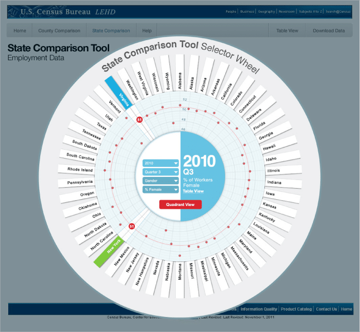
In 2012, the US Census Bureau was looking to visualize a complex set of employment data for the general public. Our team proposed a custom-built dashboard application that would serve the Bureau’s needs best. The Census Dashboard Application compared state employment data over time by age, industry, and location. It presents the data in an easy to understand, interactive format.
The ability to screen vast volumes of information according to the end user’s specific needs – and then reveal insights in a format that is readily understandable – that makes the dashboard an unparalleled tool for data analysis.
Designing A Digital Dashboard
To be most effective, a digital dashboard must be uniquely designed to meet a specific business need. There are four project phases to work through when designing a Digital Dashboard:
-
Discovery Phase
– What are the specific business use cases?
When designing a Digital Dashboard, it is essential to start by defining the tool’s scope. Boost Labs calls this phase the Discovery Phase. Once these design constraints are established, our project team can recommend data formats, types, and set sizes.
-
Analysis Phase
– What’s really “in” the available data?
One of the things we do best is data analysis. During the Analysis Phase, our business analysis and information architects scour the data for analogous and actionable relationships, including obtuse, unconsidered, and multifaceted connections. This analysis is highly dependent on information learned in the Discovery Phase. This analysis is highly dependent on information learned in the Discovery Phase. It’s only after understanding what information the dashboard will display that we begin the Design Phase.
-
Design Phase
– What will our dashboard look like?
Getting the most out of a digital dashboard isn’t just a matter of slapping a ton of information on a single screen. In fact, oftentimes the dashboard’s layout is just as important as the content itself. Our team works tirelessly drafting sketches, wireframes, and mockups until an ideal design solution is uncovered. We value client feedback during all stages of the project; however, in the Design Phase, we consider it vital. Once the ideal design is approved, our team progresses to the Development Phase.
-
Development Phase
– How does the design work?
Once a design receives approval, it’s time to put it into action. Our developers work to build a prototype, and then perform tests and refinements as needed. After everything has been tested and works as intended, we launch the site!
The truth of dashboards is that they simplify information without muting its impact. They give end-users more control over their data. Dashboards not only enhance the user’s productivity, but they do so with a visual experience that is dynamic and memorable.
If you feel you’re not getting full value from your organization’s available information, Contact us so we can help you determine the potential of your information, and design a custom dashboard to unlock it.
