Fake information has been plaguing free press for centuries. Today, the recent explosion of political fake news has made it increasingly difficult to isolate the truth. Extreme polarizing views and bigotry make up every other headline, triggering equally strong counter reactions (often violence). Not to mention the growing animosity towards journalists for reporting things that don’t follow everyone’s opinions. And figuring out what’s actually true is difficult. Like the news, data can have a strong impact when used honestly, but is dangerous when it’s deceitful. Does it even matter when data is fake? Why is it such a big deal? When data is manipulated, it opens the door for tremendous damages, destroying countless lives and disrupting different environments. Fake data has real consequences and none of them are good.
Lying Leads to Disaster
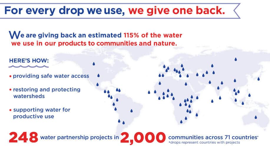
Coca-Cola claimed to have been using a sustainable method that put back clean water into the environment, but it turned out they were lying. Using buzzwords like “water neutrality” and “water-sustainable business,” Coca-Cola made a splash trying to go green in these environmentally trying times. They began by identifying the parameters of measuring the water, from farming ingredients to making the plastic bottles, but then later excluded these water units. The number they claimed to have achieved later on, was nothing more than a lie. Coca-Cola only counted the water that ended up inside each bottle, excluding water used in the entire process. But Coca-Cola continues to claim success in water conservation, 5 years ahead of schedule, even.
The data isn’t entirely fake, some numbers are probably real. But the deceit comes from intentional omission and the lie does more damage than any semi-accurate data is worth. Sure, productive water use has created trenches in Mexico to help transfer water to trees and saplings according to Coca-Cola. Mexico, on the other hand, discontinued these trenches because of the ecological damage and erosion they caused. This is only a small example of the kind of damage fake data creates.
One of the biggest scandals to shake the tech industry in the past few years (other than Facebook) is Theranos. Founder and CEO Elizabeth Holmes built up a legacy before she had results. Holmes promised revolutionary blood testing that would give accurate results with only a drop of blood. But the facade was so big that even though there was no progress, the company managed billions in investments. So what was it about Theranos that caused it to implode? Fake data! Holmes had nearly $1 billion of investor money, but had nothing to show for it. Theranos set up a fake lab for Vice President Biden to see during his visit in 2015. But the worst of it is that after faking test results, Theranos rolled out testing in stores, compromising the health of patients with inaccurate blood results.
And if you think these companies don’t really affect you, don’t worry. There are plenty of new scandals that expose fake data attempt from a variety of industries. From rising dairy farm carbon dioxide emissions to defective steel and cars, you’ll find that fake data is everywhere and it may have affected you already.
Spotting Fakes and Being Objective
Not every piece of fake data is from a multi-billion dollar industry, some are just really bad visualizations. If a chart or graph looks too simple, odds are something has been manipulated. Surface manipulations are easily done by skewing the scale or ignoring the numbers, creating seemingly drastic or pointless data points to support a specific claim. And no matter how unrealistic or uncorrelated an opinion is, anyone can lie about data.


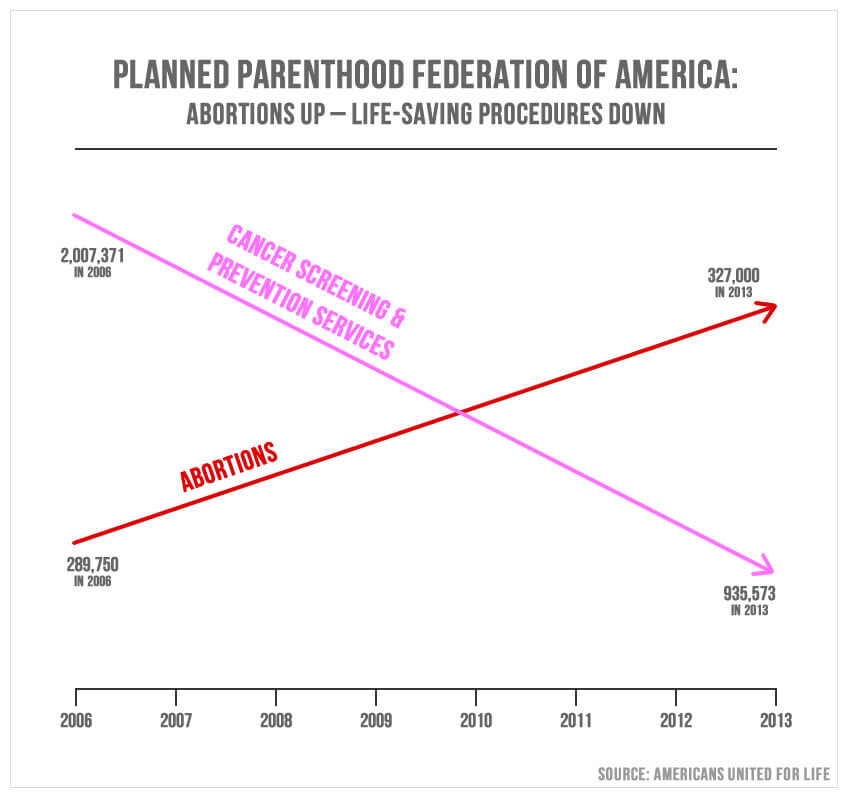
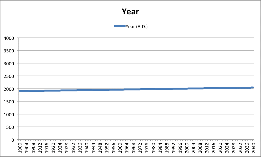
These graphs are wildly misleading, even if the numbers are correct. On the top, data points for 2013 indicate that 327,000 is larger than 935,573 while claiming cancer prevention services are somehow linked to abortions. On the bottom, the y-axis values range from 0 to 4000, even though most items are clustered around 2000. Additionally, the x-axis values cover 140 years, making it impossible to see any real changes. The data is rendered pointless because there is little room for analysis looking at a straight line. Good data should be analyzed every step of the way, even in its final visualized form. An ideal visualization is one that is accurate and displays data objectively. But it’s not always so easy to pick out the fakes.
An objective eye means to verifying the so-called facts and context of the data. Even if you believe something to be true, research should always be part of analysis. There is a wrong way to analyze and visualize data, and it’s lying. No matter what your agenda or opinion, fake data is dangerous.

