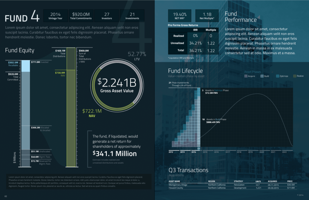
We have all data that’s been collected and we want to use it in reports, infographics, website content, presentations, apps and the list goes on. Data visualization is a great way to accomplish this. With tools like Tableau and Domo, organizations have been able to create their own insights easily. Recently, we’ve spoken with these organizations who have become disenchanted or frustrated with the process of data visualization in their organization, even with use of visualization tools. The main issue: they don’t understand what’s being visualized. In the end, some of them revert to excel spreadsheets or PowerPoint presentations, while others sought the help of a data visualization firm to fix the issue. If you’re frustrated with how your organization uses data visualization, we would like to share a couple of insights to help you get the most out of your data visualization process:
- Data visualization, by definition, pulls data from a source or multiple sources to visually show trends, patterns and insights. Data analytics is a source that collects data such as Google Analytics. It is not the role of data visualization to collect data, rather, it’s primary role is to visualize the data.
- A story is not being told with the data – Pretty charts and cool interactive visuals by themselves are not effective alone. The best examples of data visualization products starts with a data storyline. What’s the end point you are trying to make? How does the data story help make that point?
- You are using too much data – You may be telling a story with your data, but you are noticing users are not fully engaging. To be memorable, stories need to be simple and clear. Look at your data. Do you have too much detail in the visual story? Are you using data to support every detail? How relevant is the story to the target audience? A clear, simple visualization and call-to-action is more effective than all the bells and whistles.
- You are using the wrong data – Look at your target audience to validate the use of your data sources. Are you pulling data from one source when you should be pulling data from another? Although you have access to many data sources, it may not be necessary to include all of them.
- Data visualization is a process. If you have a data visualization product that performed well for the first year, but has seen a big drop-off in user engagement, your users’ behavioral patterns may have changed. The data may still be relevant, but the source of data or type of visual may no longer be applicable. Taking time to evaluate your users’ needs will help you keep your data visualization products relevant and effective.
We hope these insights will help you turn your frustration into satisfaction with your data visualization process. If you would like to understand more about data visualization and using it effectively. Contact us today and see how we can help you with analytics and data visualization.
