Reports are Vital
Most companies, nonprofits, government departments, etc. make reports every year. These reports range from ad hoc and consumer reports to fiscal and federal reporting. For example, a financial report shows stakeholders and execs how well business is performing. An annual report assesses last year’s performance. And a budget report shows how much money was spent and where it was spent.
Sounds simple. With information this straightforward, why bother with anything else? Because that doesn’t yield the results you need.

Why are you making a report (besides it being mandatory)? What are you trying to prove or achieve? Whatever the bottom line is, you need the report to stand out with the right content and a good look.
Make the Connections Clear
Let’s be honest, no one wants to take extra time to read a report that doesn’t tell them anything. Why else are they looking at a report? You need to tell your audience exactly what they need to know.
You can say the department spent $99,999 on research, but that doesn’t say anything. Say the $99,999 spent on research due to growing demands. This helps prove the point that the department needs the same/increased budget for the following year in order to maintain performance.
Don’t just say sales are up 17%. Say sales are up 17% from the previous year because of the new ad campaign that cost $10,000 but had a 3,000% ROI, etc.
There’s always more to the numbers and it’s your job to make sure your audience understands the important insights by leading them to it. If not, it’s easy for anyone to overlook all those numbers and statements. And then there are no results. Don’t assume everyone will make the same assumptions you did, because they won’t. Prove to your investors or the public that your numbers mean something.
Designing the Report
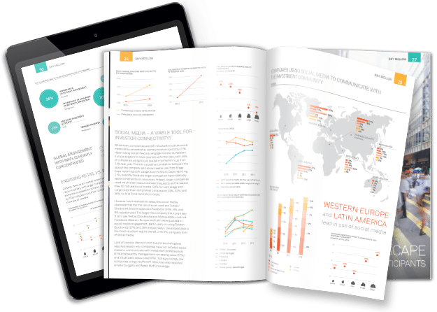
The design of your report can also affect your audience. If the report is packed with too much, it’s hard to read. Too little info and there’s nothing to look at. Harsh colors and messy layouts might counter the content, regardless of how good the data is. Just like the data, the design also needs to follow the story. Make sure the visual flow follows the data. Presenting numbers out of order is confusing and might complicate communication between executives, investors, or anyone else who reads the report.

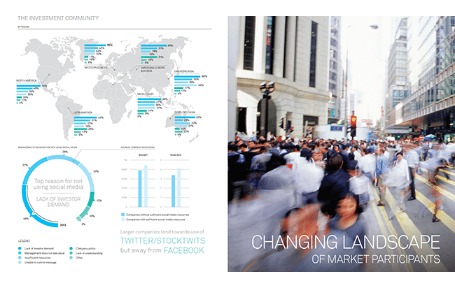
You’re making reports at least every year, so why not make the most of it? Take advantage of data visualization and make your report as informative and compelling as possible for the people who read them. Visualizations offer a better way to represent large data sets. You can compare previous years’ performances in the same chart that’s easily understood at a glance. Or easily use a map to indicate metrics across the world.
Don’t like building a new report every year? Consider an automated report. For businesses and agencies that produce the same formatted report every year, getting a custom designed report saves time. A custom report has a personalized template based on your data and will continue to format future data in the same way. Or let a dashboard collect real-time data and give you usable metrics. A whole year’s worth of data is a lot to look at. Make it easier for yourself by using data tools. You can get results, but only if you analyze your report the right way.
Contact us today and see how we can make your report stand out with data visualization.
