Creating interactive data visualizations is a challenge for those not savvy with code. There are tons of resources out there that teach how to use these data visualization tools, but to be honest learning design principles behind visualization along with code to create a final product is a heavy lift in a short period of time. That is why we specialize in not just the front-end development but the enterprise architecture need to complete these interactive data visualization projects. In this article, we talk about our thoughts on Google Charting Tools and a basic example of how to quickly get started building a basic visualization.
Background
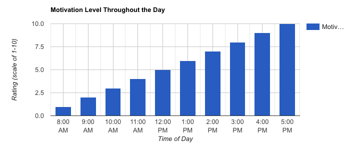
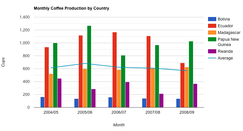
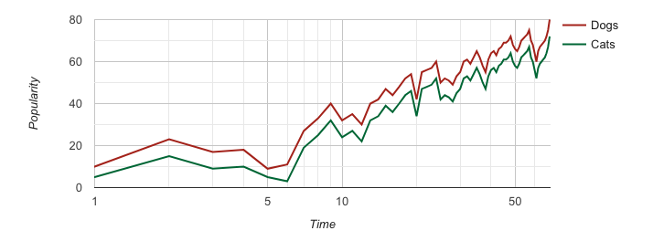
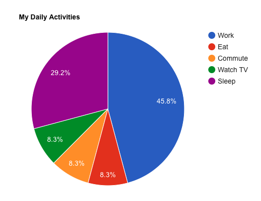
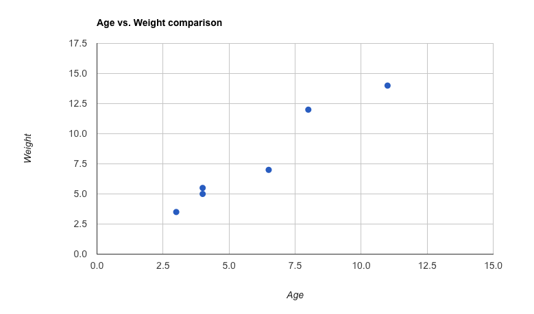
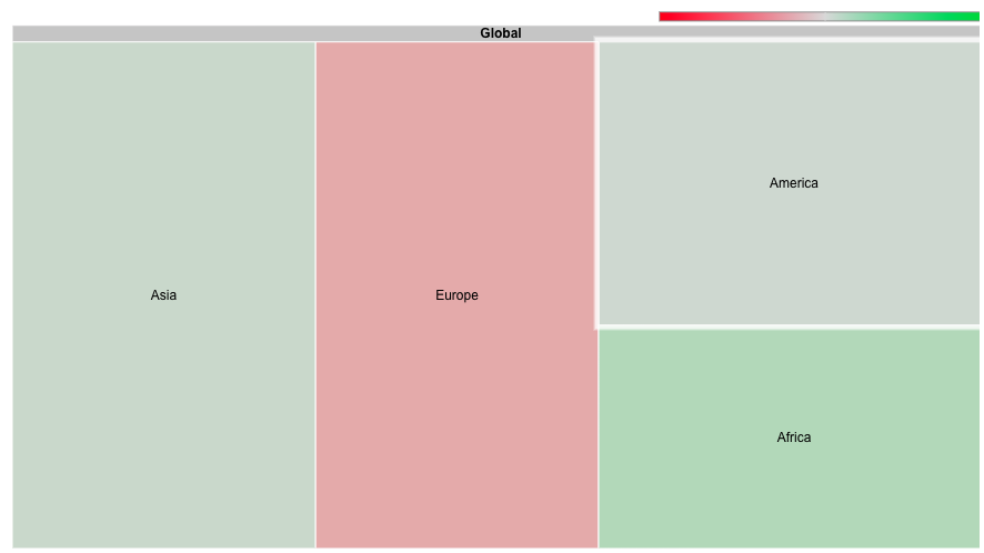
Google charting tools out of the box are very effective in producing a quick dynamic visualization. Foundationally as a visualization solution it can scale to growing data visualization needs that require traditional graphs. A strong development community supports the charting tools so if customizations are needed, there is an abundance of information to help the more technical user reach their goals. There are pluses and minuses to Charting Tools and one major plus for us is the ease of how quickly one can get started, however, a minus is the look of the final product. As with every visualization tool its best to look at the available example libraries available to see what sort of visualization options can be produced. In this case, the Charting Tools library items are basic in nature, which limits the creativity of creating a more dynamic feel to truly engage with data.
Customization is an option for almost any toolset out there; however, the development cost vs value will need to be determined based on the data story need.
Having Fun:
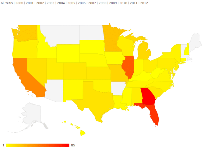
Our Data Story: “US Bank Closures over the Last 12 Years”
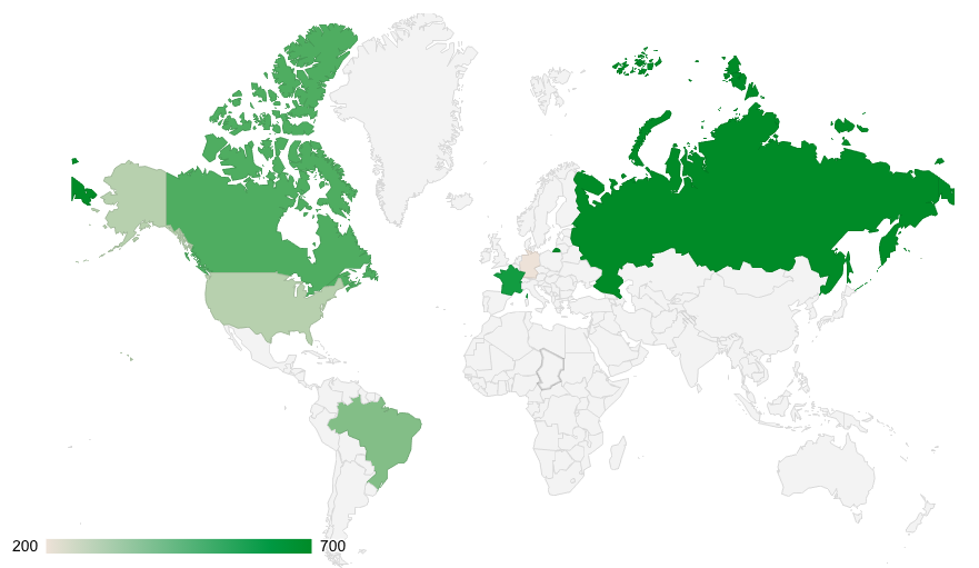
The data source originated from a flat excel file sourced from Data.Gov. It was converted into a published data source (API) using an internal Boost Labs tool to make it easy for Google’s Charting Tools to access a public data source rather than a flat-file. From there we used Google’s Geo Chart to quickly create an interactive visualization that showed specific banks per state that closed over a 12 year period. The user can also select a specific year to view specific bank closers per state within the specifically chosen year.
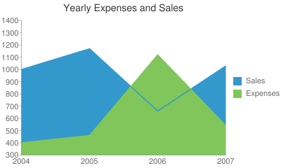
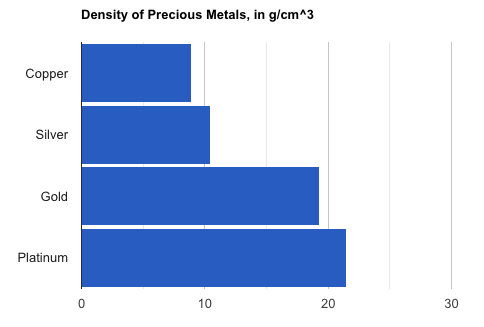
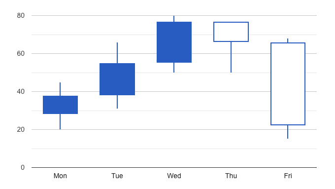
Google Charting Library Examples:
 |
 |
 |
 |
 |
 |
 |
 |
 |
 |
 |
 |
Question about Data Visualization Tools? Contact us today!
