Picture this scenario: You are sitting in an investor meeting or an executive meeting reviewing the previous quarter’s profits and predictions. You’ve brought an interactive, visual report that was prepared by your team based on a data story you want to tell. At first the stakeholders love the data visualization and the meeting is going great…until…one of them points out that the visualization doesn’t make sense to them. They want to know how they can make decisions with something they can’t understand. We see this all time, but it’s not the end of the world.
What is Self-Service Business Intelligence?
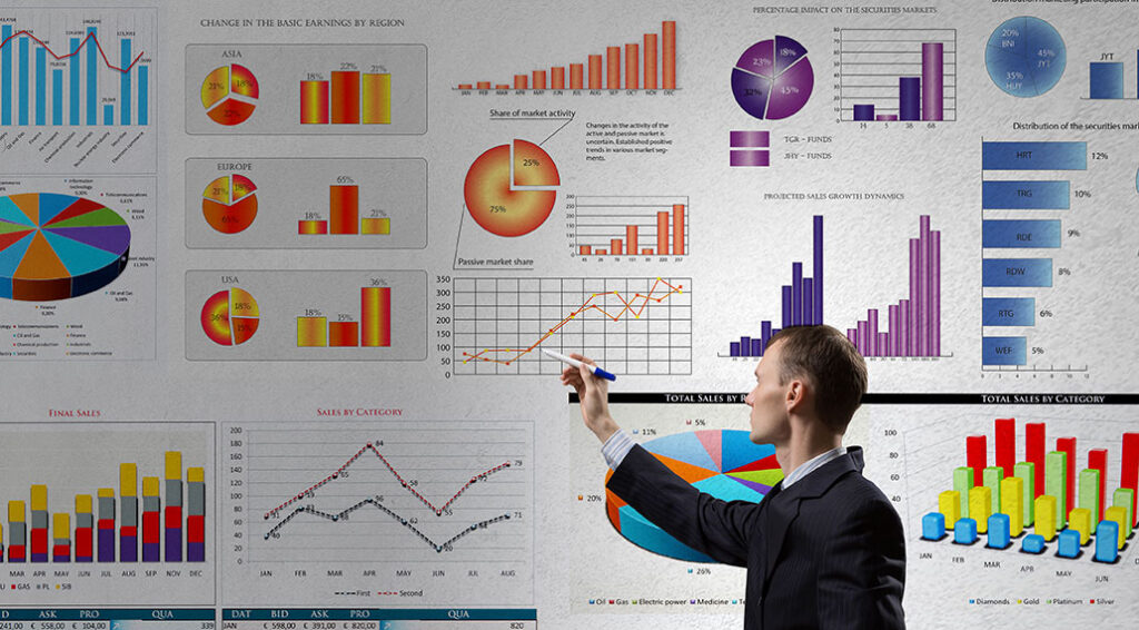
Self-service business intelligence is simply accessing and gathering your own data using business intelligence (BI) tools. BI tools are used to pull, analyze and visually display data for decision makers. Common BI tools include Domo, Tableau, Zoho, SAP Crystal Reports and Microsoft Power BI. Self-Service BI tools are very attractive because they are cost-effective and the user does not have to be a statistical data analyst to create visually appealing reports. PRO.
This sounds great! So what’s the CON?
The author of the visual report relies on the tool to prepare and present the data in a clean way. Again, this doesn’t sound so bad, especially for someone who is tasked with this responsibility among other responsibilities and who understands the data. Input the data. Let the tool do the work…and…BAM…the visual report is ready for the boss. But what if the Boss doesn’t really understand the data like in the previous example?
Well…let’s look at this a little deeper.
Before using BI tools, the data…the BIG data…must be understood. It is this deep understanding, most often done by data analysts, that helps bridge the gap between the big data and stakeholders who rely on it to make decisions. The most effective way to bridge the gap is to create and tell a data story visually.
As you know, every great factual story involves research and examination by the author. They try to understand what is happening and the facts before writing the story. The author uses a tool such as MS Word to write the story, but the author still relies on others such as an illustrator and editor to bring the story to production.
The same can be said with a building a great DATA story visually. Just like the author, a data analyst dives deep into an organization’s big data to see what is happening, examines it and pulls the right datasets to tell the data story. They use BI and data visualization tools as resources to help visualize the story, but do not rely on these tools alone to create a visualization product that can be understood by the audience. The solution: the data analyst needs to work with a team to create a visualization product that the target audience will get. This team will have the skill set of not only understanding the data, but also understanding the audience who will consume the data.
And, Therein, Lies the CON
Self-service business intelligence relies on the BI tool to tell the data story, but the tool, itself, cannot tell the story to the non-analyst user. When tools like Domo and Tableau makes data visualization look easy to the effect of plug-n-play, the individual builds data visualizations from surface-level data thinking that it is the complete data story, because they do not know how to tap into the goldmine of the big data. Therefore, the data story is shallow, incomplete, confusing, and sometimes inaccurate.
How We Can Help
Are you currently relying on self-service business intelligence and missing key elements in your data story that prevents your stakeholders from understanding the visualization? If so, we would love to start a conversation around your data story.