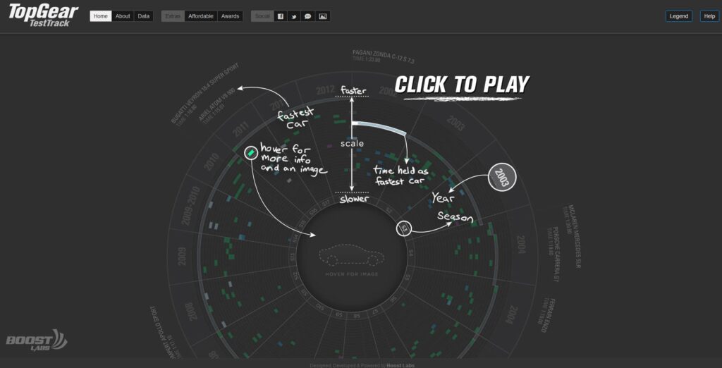
Thanks to the success of our static TopGear infographic we posted last week, we wanted to go to the next level… we need to go interactive. The static version of the TopGear infographic was packed with a ton of info and even we believed it needed to be easier to navigate through. Our solution was to take the same infographic but allow the enthusiast to get more specific information faster and be able to take control over how the data is being digested. We also collected all the feedback on mistakes from the original static infographic and applied the corrections onto the interactive version. Check out the TopGear Interactive visualization. Enjoy!
