“Data analysis.” Those two words can make any employee assigned that particular task cringe. With the enormous amount of raw data pouring into businesses these days, the job of analyzing, organizing, and presenting information clearly and concisely can be overwhelming. This process, however, can be made much easier through data visualization, which is not just making a report prettier.
What is Visualization?
Data visualization is the process of collecting, understanding, and conveying information using graphic representations.
Imagine a pre-1980s newspaper with an article full of statistics, analyses and conclusions. Suddenly, along comes The USA Today in 1982 featuring “USA Today Snapshots,” those colorful little bar graphs and pie charts in the lower left-hand corner of the newspaper. Readers could now understand complex information with a glance.
Business administrators face a similar challenge each and every day. Staring down reams and reams of documentation or screen after screen of data, crunching the numbers, comprehending what those numbers mean, and presenting the facts is not easy.
“Design” isn’t a Dirty Word When it Comes to Data Analysis
A picture is worth a thousand words…and data visualization is worth a fortune when employees utilize it correctly. CTOs and CIOs use algorithms to build user profiles based on online user activity, cookies, and purchasing habits. Government agencies generate work force reports based on census figures, IRS data and so forth.
To some, data visualization means taking all of that raw information and creating a report featuring basic graphic elements (pie charts, graphs, etc.) and page after page of statistical analysis. Most company’s clients, managers and staff simply don’t have the time to process those types of reports.
With a top quality visualization key information is boiled down to its essence with simple-to-read, easy-to-understand, high-end graphic representations. This makes the reporting easier to comprehend, and allows the user to add context to data that may otherwise be difficult to see. Multi-dimensional charts, interactive dashboards and even infographics give data better storytelling potential than text alone.
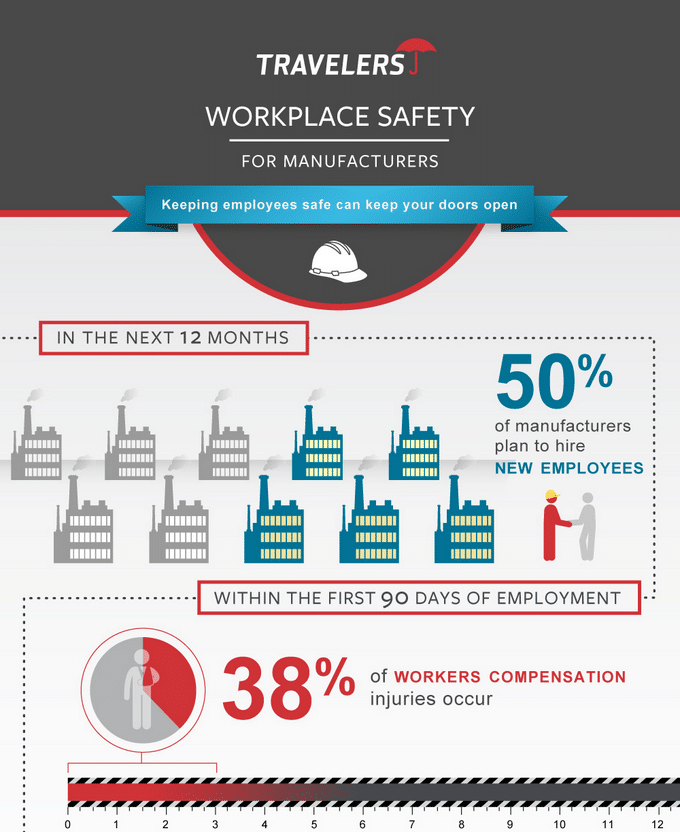
Consider this example: Travelers Insurance wanted a report that could communicate a great deal of information without requiring high-level understanding of the data behind it. The result was an excellent series of static infographics that each show valuable information about specific topics in an easy to understand way.
Visualize Your Future
Every statistic tells a story. The purpose of data visualization is to understand and process those stories efficiently. Data visualization simplifies the difficult task of analysis so companies can focus on the real work—using the information to move the company forward. Visualization isn’t just a way to make data look better, it’s a way to make the data work better.
Contact us and let us help your data analysis tell the right story, the best way it can.
