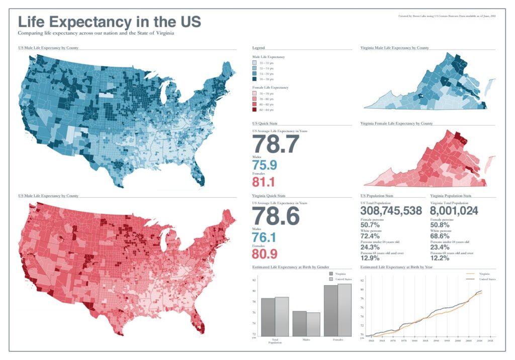
We simply love geographic visualizations. It’s simple to understand and data integrates well with it. In some ways, it serves as one of the best foundations to unify a variety of datasets to create a powerful tool. More specifically, location (geo coordinates) serves as the common variable to link various data sets together. As outspoken advocates for perfect user interface design, we love geovisualizations that are built well. Users can easily relate to them and will spend enormous amount of time engaged with it.

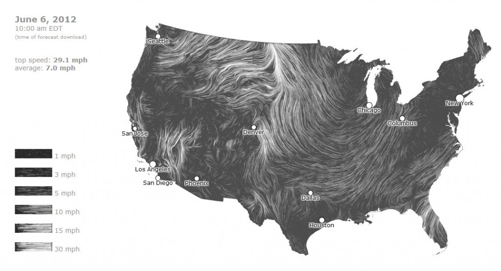
As geovisualizations get more popular, new and interesting solutions pop up all over the web. One of our favorites has to be Wind Map. By using HTML 5 canvas and connecting with National Digital Forecast’s data, Wind Map is able to visualize wind flow across the US. The information is in real-time and provides the user the ability to zoom and navigate through different areas of the US to understand wind flow direction in specific locations. The best part is the option to view past wind flows via the gallery to see historically how wind patterns have changed over time. Very simple to understand, very simple to use.
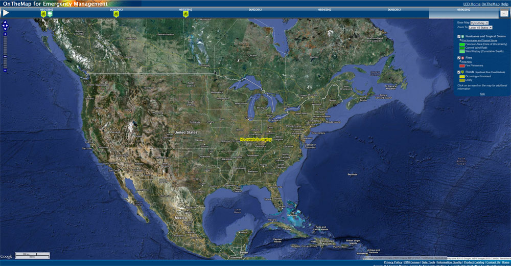
The Census Bureau is working on interesting projects that involves open source geographic web solutions layered with data: OnTheMap and OnTheMap Emergency Management. Both tools use labor data as a foundation, but OnTheMap Emergency Management combines labor data with National Weather Service data to help inform the public of how weather emergencies are affecting the workforce throughout the country. Both tools do an amazing job of using their assigned data sets to provide the most up to date information as possible. For the average user, both tools use geographic visualization in order to pave the way to how we look at “Big Data” and understanding it.
As a company specializing in data visualization and web innovation, we can see how geographic visualizations are providing the base line to help incorporate complex data and be effective to gain the attention of users online. With better user interaction techniques like the ones incorporated with Wind Map, the ability to take powerful geovisualization tools to the next level in order to fully engage the user immediately will create wider audience adoption rates. Other innovations such as online social interaction and historical data captures will further expand the visualization into more complex areas, but will still provide a simple foundation for dissemination using geovisualization.
Having a visualization be effective to a large audience is the best feeling in the world. Our belief is that geovisualization is an effective way to gain the attention of a large audience. To us it simply works. What are your thoughts?

