But making these visualizations? Traditionally, it’s been pretty difficult.
Combining elements of good design, data analysis, and more into an effective visual representation of a data takes a lot of time, experience, and tools to do it right. However, IBM’s Many Eyes project may change all of this.
Described as a tool that democratizes data visualizations, the appeal of Many Eyes is that anyone with a good set of data can make attractive visualizations. Here’s how their website explains it:
No programming or technical expertise is needed, so almost everyone has the power to create visualizations. You simply follow three steps:
- Upload your public data set. Visualizations created on the Many Eyes website work from simple data formats, such as a spreadsheet or text files.
- Select from a wide variety of visualizations or one recommended by Many Eyes.
- Unleash your insight by sharing your visualization over the web. You can embed a visualization in your blog or easily share it on Facebook and Twitter with a single click.
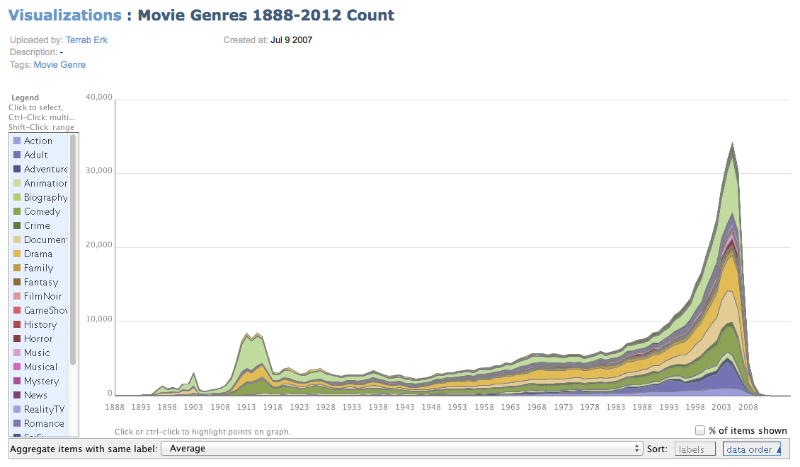
As an example of what Many Eyes can do, here’s a graph that examines the frequencies of movies by genre from 1888-2012:

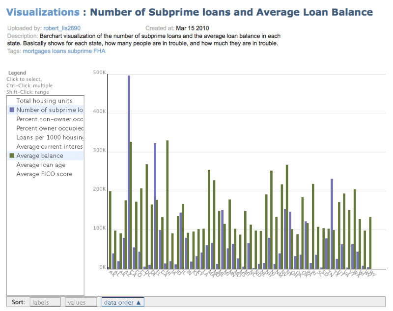
And here’s another visualization that tracks the number of subprime loans and average loan balance by state:

Because it’s an easy-to-use tool, visualizations created using Many Eyes have many unique benefits:
- You’ll easily see the same information from different angles. Since you can use the same data to easily generate multiple visualization types, it only takes a few clicks to show the same data in a different way. This can potentially reveal even more insights.
- You can present your data to different audiences and test which method is the most effective. Just like you should test headlines and advertisements, you could create multiple visualizations and then see which ones drive more signups, sales, and other business metrics.
- You can easily create as many visualizations as you need. Sometimes, you’ll need to create several different visualizations to effectively communicate your message. In this case, Many Eyes can save you a lot of time and energy by allowing you to create a visualization in just a few seconds – not weeks.
Many Eyes is Wonderful, But Watch Out for This Major Pitfall
If this article has you thinking about what kinds of visualizations your business could benefit from, good! The meteoric rise of infographics since 2011 shows how powerfully audiences respond to visual representations of data.
But there’s more to visually communicating data than simply using a free tool on the web – no matter how cool or useful that tool can be.
Good tools are only as good as their operators. The unfortunate truth is if you’re not a data-savvy individual, even the best tools are limited in how they can help.
If you want your visualization to work, you need to answer questions like,
- What data should I use to create my visualizations?
- Are there any relevant public data sets I should access to create a more useful, informed visualization?
- What type (or types) of visualization should I use to meet my specific business goals?
Reviewing all of your visualizations before use will ensure the questions above have satisfactory answers, as well as making sure your visualizations are correct and relevant to your audience. Smart organizations handle this in two basic ways:
- If your organization happens to have someone that’s familiar with data, perhaps that person can review your visualizations and verify their accuracy and relevance before using them publicly.
- If your team lacks a dedicated data-savvy analyst, you may want to make data visualizations created with free tools for internal use only, or perhaps for only minor marketing efforts.
In addition to the theoretical problems with blindly throwing data into a tool like Many Eyes, many users reported running into technical problems due to the site’s outdated (and potentially insecure) version of Java.
Many eyes simply can’t deal with complex data. Big data usually needs designers and developers to create a seamless visualization. You can even have an interactive visualization, but not with Many Eyes. Nowadays, there’s a large variety of data visualization tools with different aesthetics. But if you have a lot of data, Many Eyes is not the solution.
Overcoming the Limitations of Free Data Visualization Tools
Free tools are inarguably valuable, but remember: you need to use caution when determining how you’ll use them. You don’t want to undermine your marketing efforts by trying to save a few dollars.
And if you intend to use a visualization for a forward-facing campaign (or if you need to construct a more sophisticated visualization for either internal or external use), free online data visualization tools like Many Eyes probably lack the customization and power you need to create a genuinely striking visual. In this case, it’s time to take your visualizations to the next level and outsource the project to a contractor or consultant.
At Boost Labs, our data specialists know how to pull data from sources relevant to your business and use visualizations to reveal unexpected or hidden points of data – data that could grow your business or significantly decrease your operating costs. Whether it’s using a free tool like Many Eyes or creating a custom data dashboard built specifically for your business, we can help you make the most of your data.
