Building a Better Experience for Measuring Enrollee Success
Project Brief
Hooli is an alias for an organization devoted to improving health and wellbeing by inspiring the cessation of smoking, vaping, & nicotine. Smoking cessation not only benefits those who quit, but also employers and health insurance companies, who partially pay the burden of time and health costs associated with smoking. A new program was launched to incentivize and help employees who wish to quit smoking or vaping follow through, and is paid for through insurance and employer channels. Employers subscribe to the program and desire to track employee goals and progress.
Before our involvement, account managers utilized Excel spreadsheets to review data and manually created reports in PowerPoint for customers. This process was time consuming, and limited in its abilities to report time-sensitive data. When data is old, payouts and other incentives for employees are reduced, and participants who could use a helping hand go unnoticed.
“Thanks for the great work…
This project is wrapping up nicely. Thanks for your help.”
— client testimonial
Capabilities Delivered
- Business Intelligence
- User Research
- UI/UX Design
- Rapid Prototyping
- Data Visualization
- Reporting
- Data Quality Assurance
- BI Platform Development
01.
User Flow
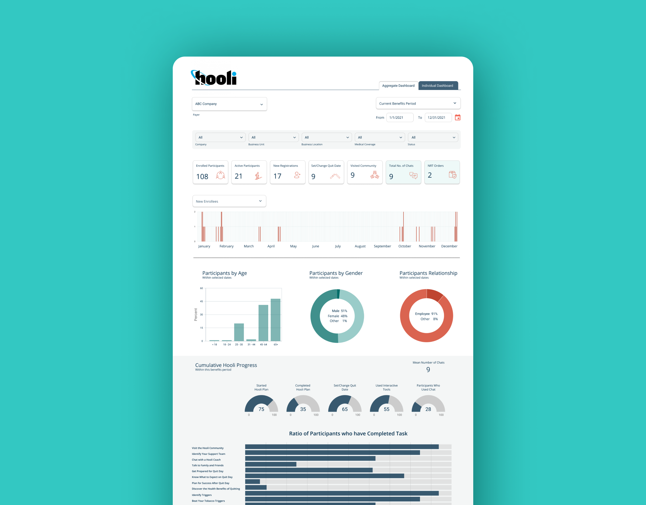
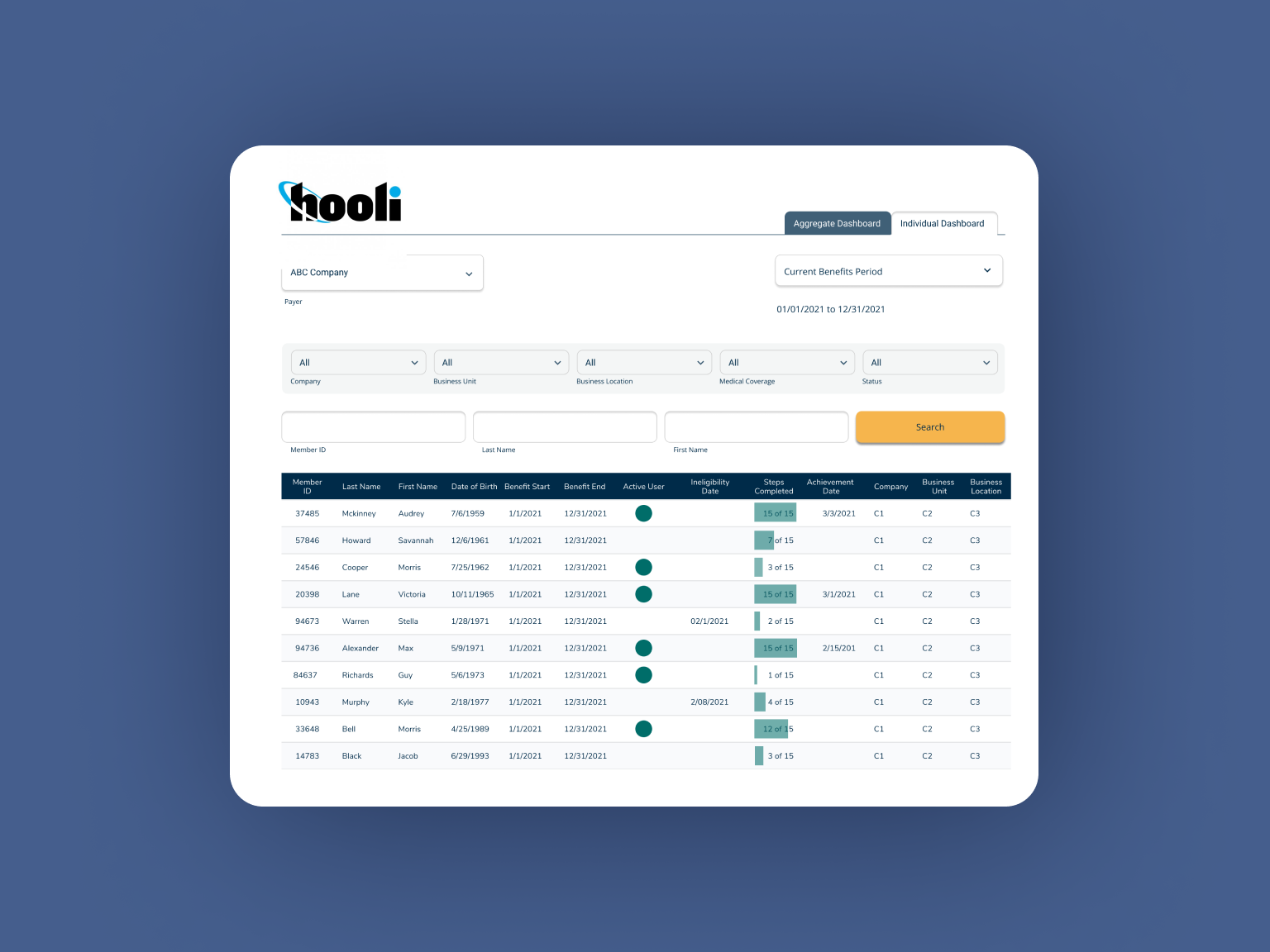
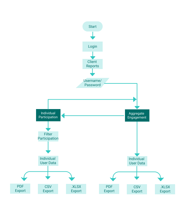
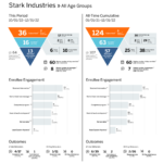
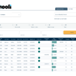
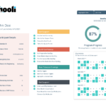
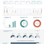
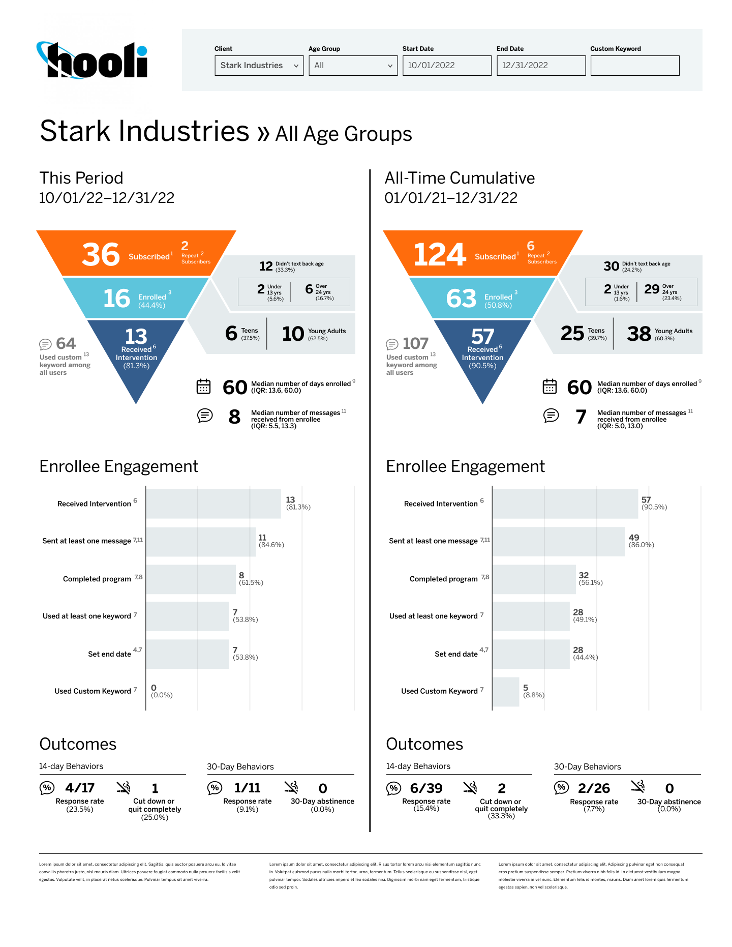
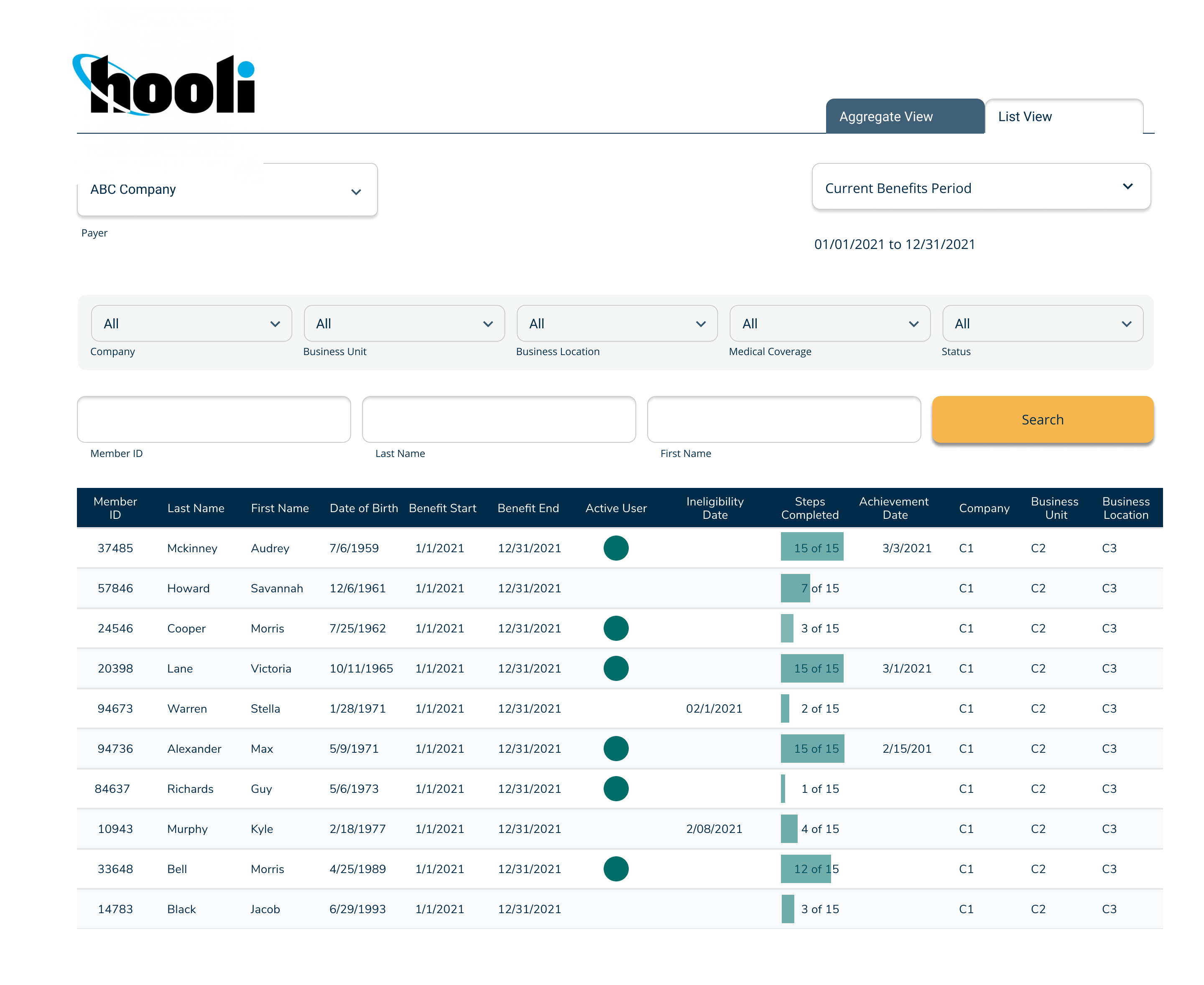
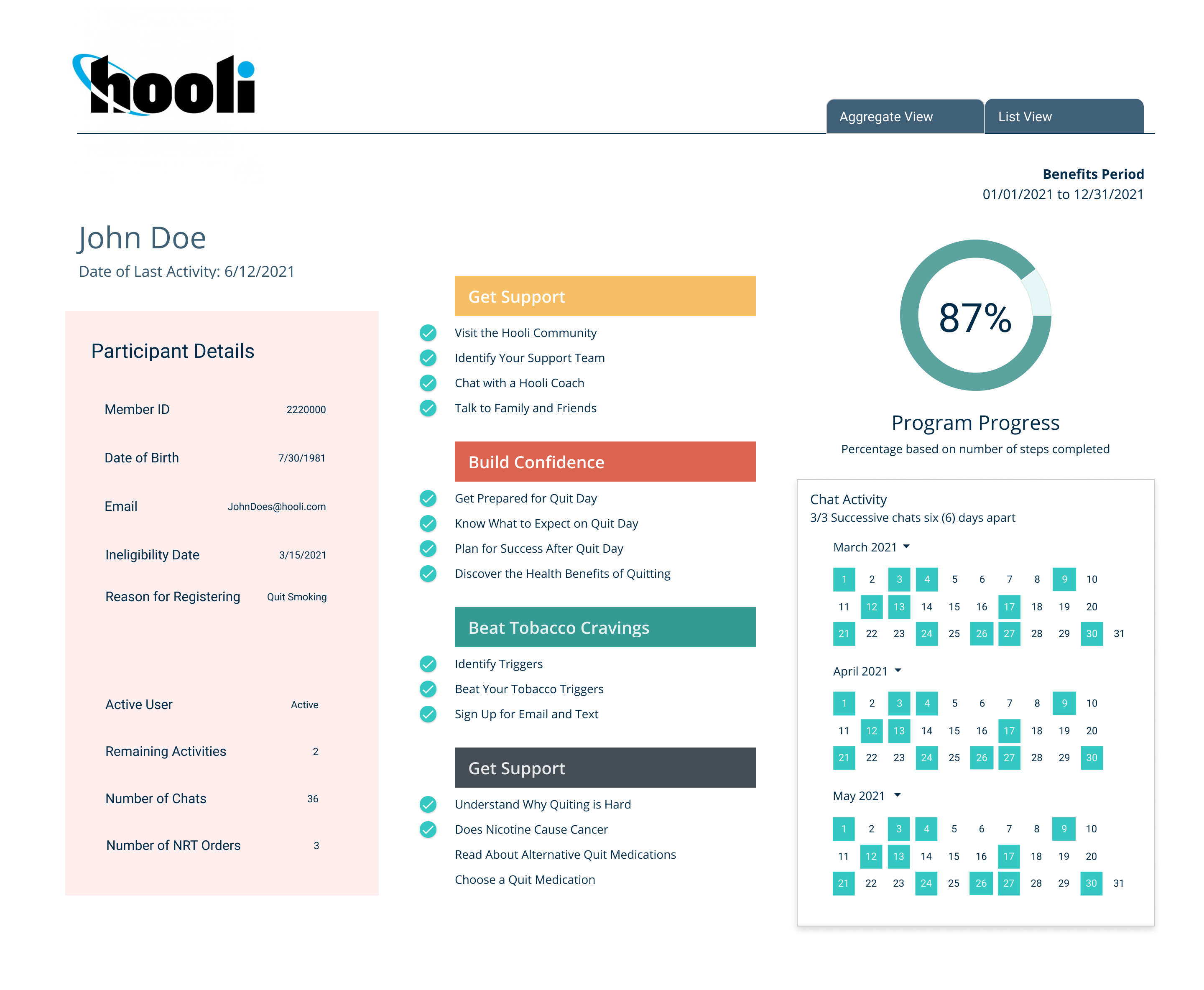
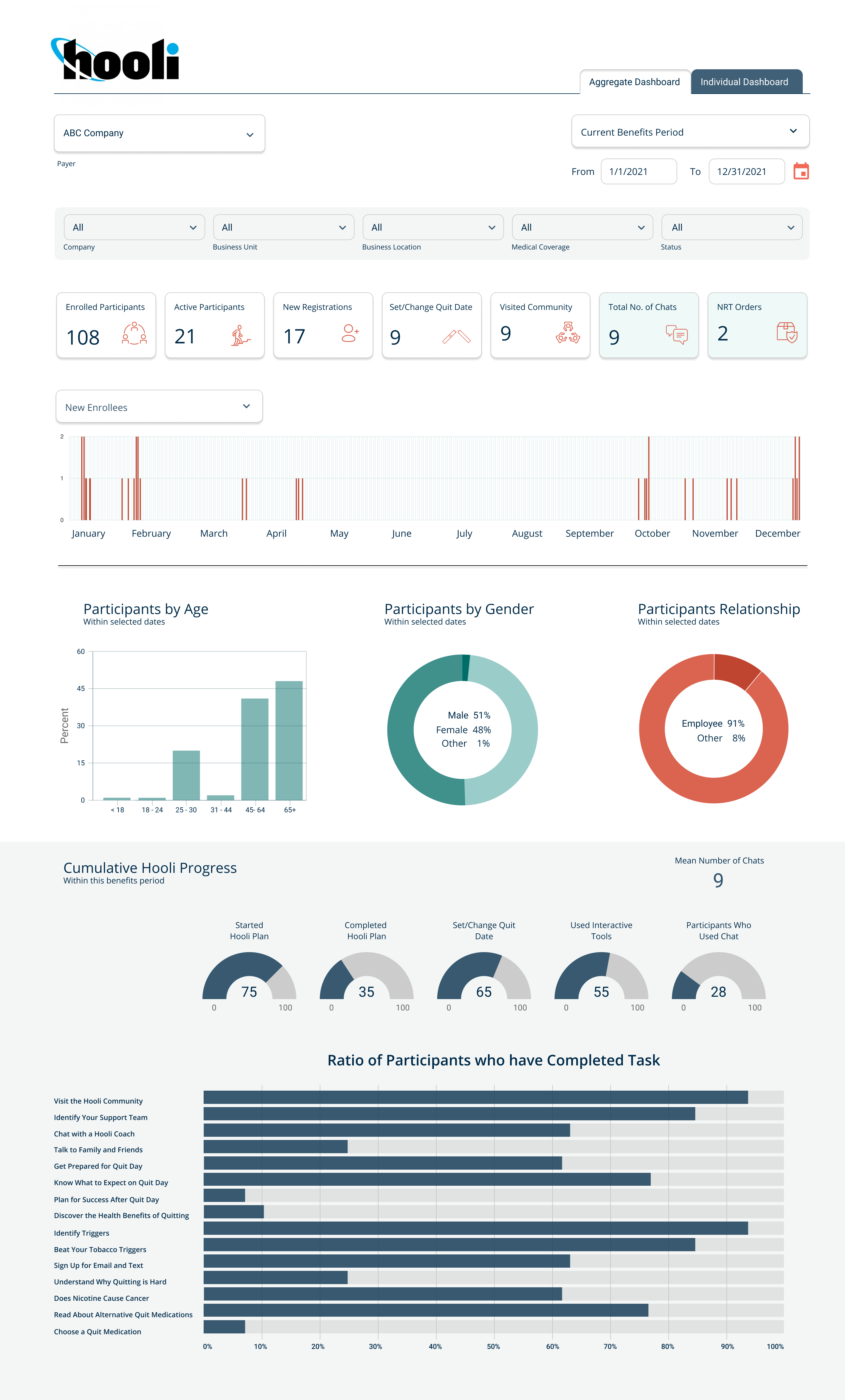
User Personas and a User Flow Diagram helped us understand the needs of client reps who would use the application. Their first concern would usually be what overall aggregate participation and completion of the program looked like amongst all users. Then, their focus could shift to individuals in the program, first by a comparative view which puts the details of individuals side-by-side with others in the program for context. Then, a user could drill into a detailed view on any single individual. Lastly, the users need the ability to export the data as .PDF, .CSV, and .XLSX.
02.
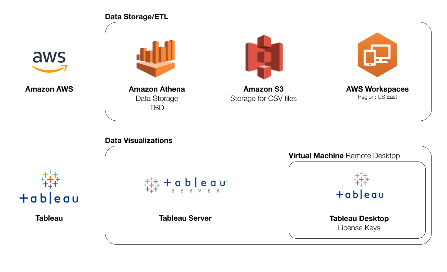
Tech Stack
Defining the technical stack for production is a crucial step early in a product lifecycle. For this client, we defined the database, frameworks, and front-end tools & applications connected. The designs would have to be implemented in Tableau Desktop and published to Tableau Server utilizing data from AWS.
03.
Sketches
In initial brainstorm sessions with stakeholders, which takes a few hours, a UX designer roughly sketched the layout of front-end pages identified in the user flow. The sketches identified:
- Which data KPIs would be required
- Necessary dimensions within the data
- Calculations needed
- Filters and Time Periods
- Sets of activities to include and in which desired order
- Navigation hierarchy
- Data visualization possibilities
Our sketching sessions confirmed the need for three distinct sections, each with the ability to combine filters in their own way.
04.
Wireframes
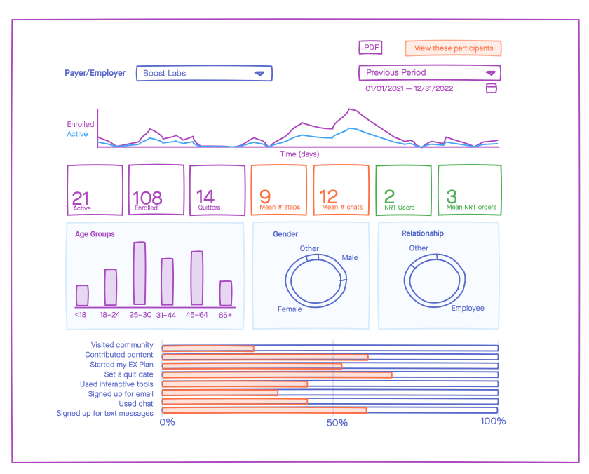
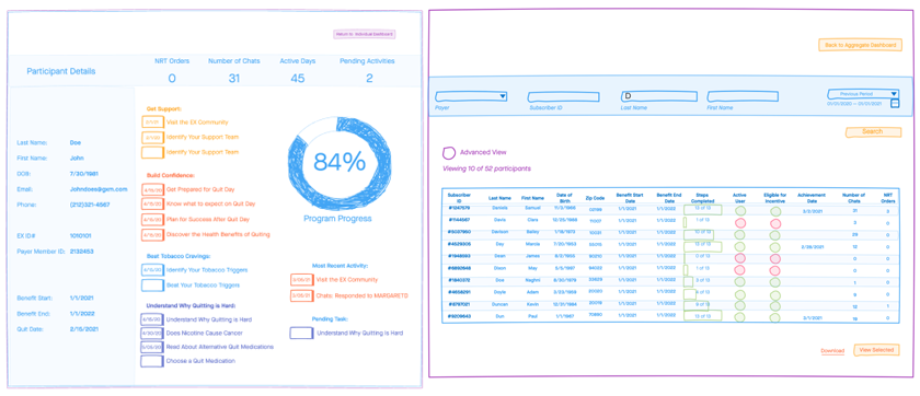
After initially converging to brainstorm and sketch rapidly, the team then diverges. At this point, the core requirements were identified and a UX Designer picked up the baton and worked independently to design wireframes in Figma.
The purpose of a wireframe is to solve for size, layout, content, hierarchy, data visualizations, and interactivity like navigation. Simply put, a wireframe is a monochromatic blueprint; a layout of all needed interface elements.
Effective wireframing involves quick designs, iterative stakeholder feedback, and an early feedback mechanism for usability tests of users. It took approximately five weeks to complete and approve all wireframes.
Wireframes do not include branding, colors, graphics, photos, or other detailed visual elements which are unnecessary to garner approval for layout of key content.
05.
Designs
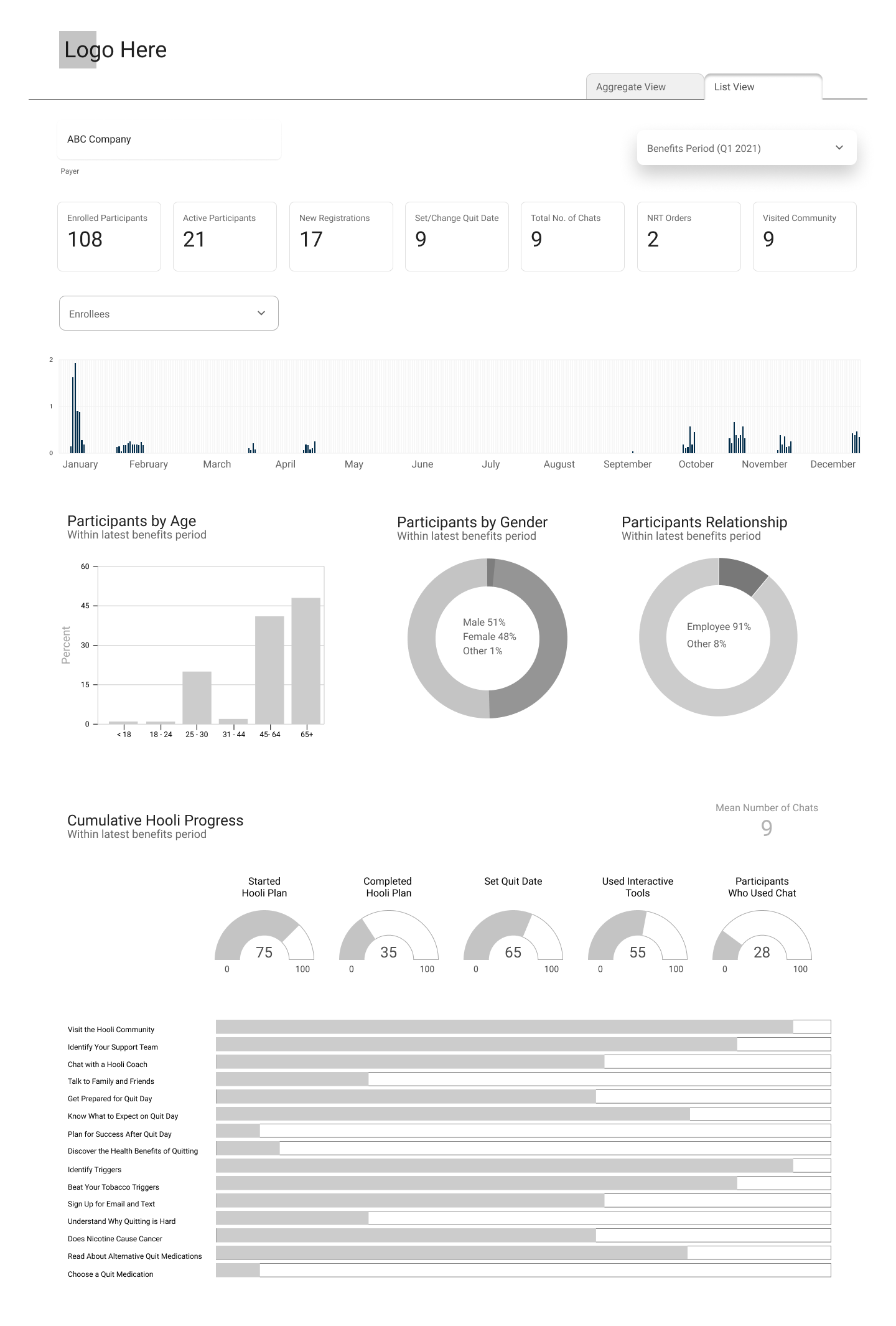
Once wireframing was completed, UI Designs were generated by a UI Designer. These final designs serve as the foundation for development, and involve technical and stakeholder input. Branding, colors, graphics, and other details are added at this time.
These final designs took about three weeks to reach approval. Once approval was granted, a designer then annotates the designs with notations for developers such as KPI calculations, type scale, hex colors, attached graphics, size of margins and padding, etc.
06.
Development
Boost Labs has a full-stack development team who, after providing input for final designs are now in charge of seeing the designed vision through to reality.
The build for this client uses Tableau to serve up optimized data visualizations specific to the user’s authorized data for their company. Care was taken during quality assurance to check and recheck that data and resulting calculations and KPIs are accurate and trustworthy, which is of utmost importance.
Verifying that calculated data is correct can be a challenge, especially when multiple layers of calculations occur within the ETL, and front-end visualizations. Add the complexity of security protocols with handling PII (personally identifiable information) and this challenge compounds. The Boost Labs team initiated a process of documenting every calculation, and holding frequent meetings between Boost Labs and client data experts in order to finalize and document all calculations. This process also empowers our client to own their platform going forward.
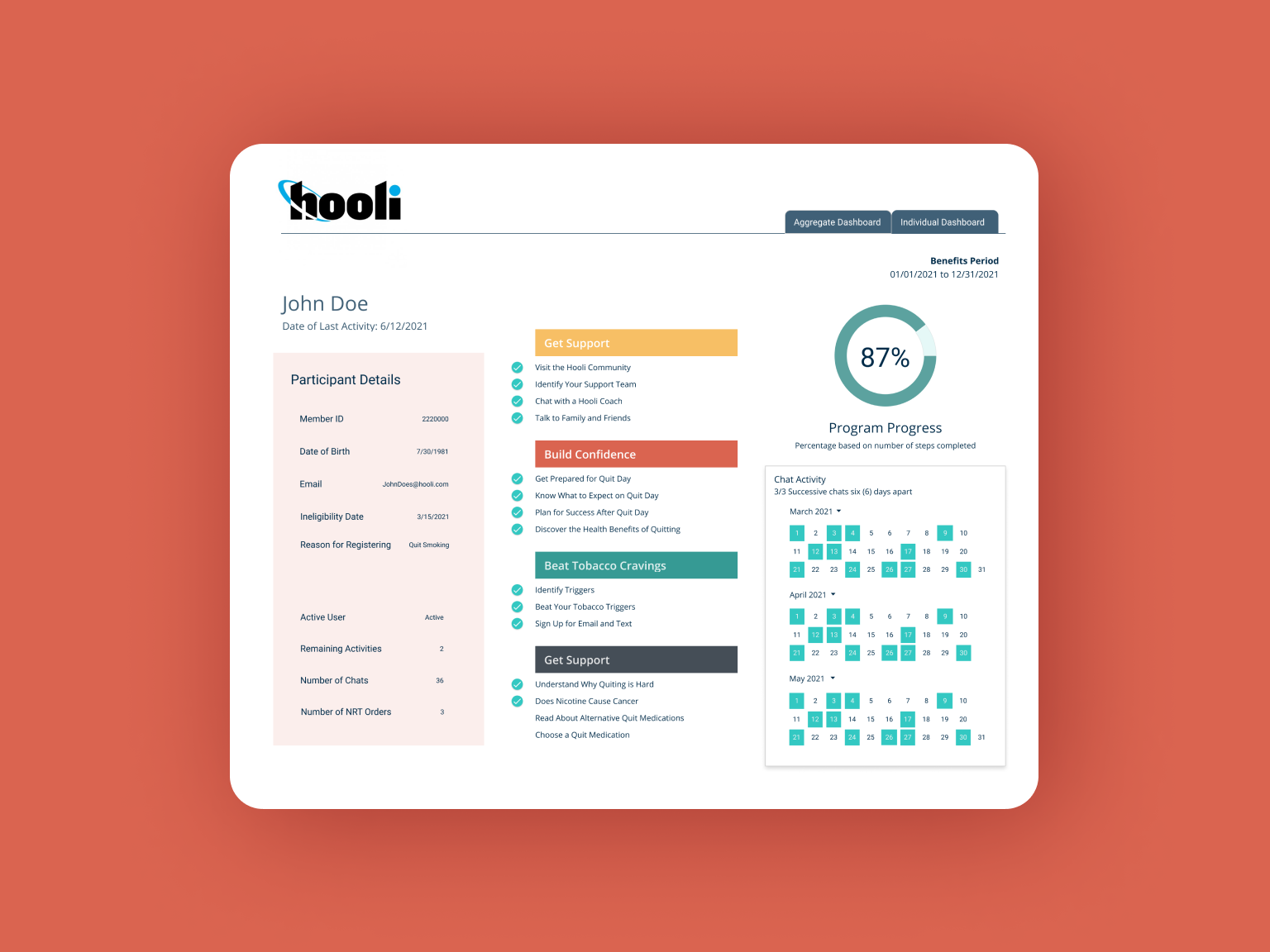
The front-end was developed by a BI Developer using Tableau Desktop and published in Tableau Server. The build is optimized for performance and ease of enhancements in the future.
Quality assurance was completed six weeks after development began and the implemented solution is now live in the hands of our happy client.